Visualizing Ice Core Datasets in Python Using a Jupyter Notebook Template
Contents
Visualizing Ice Core Datasets in Python Using a Jupyter Notebook Template#
Purpose#
Chemical constituents measured in ice cores are often visualized in a standard format, with figures produced by proprietary or closed tools. Such tools present an extra step that requires a context switch in the process of analyzing and visualizing results. Python and its many machine learning, numerical computation, and visualization libraries together with Jupyter notebooks offer a unified alternative that permits researchers to analyze and visualize ice core datasets in a single, highly-integrated ecosystem. This Jupyter notebook uses exclusively open-source Python libraries (specifically NumPy, Matplotlib, and Pandas) to create a readily reproducible, publication quality figure. We demonstrate the utility of the notebook as a template for ice core researchers engaging in open science by recreating multiple figures published by Schupbach et al. in Nature Communications, 16 April 2018. This notebook provides a step-by-step guide to systematically recreate two figures using Schupbach’s original data.
Technical contributions#
This notebook presents an annotated, step-by-step template to create publication-quality figures presenting ice core chemistry data using open-source Python libraries.
Two figures from an article by Schupbach et al. that appeared in Nature Communications, 16 April 2018, are reproduced to demonstrate how to use Python to visualize ice core data.
Part 1: First, as closely as possible, we will reproduce Figure 2 as published in Nature using the datasets provided by the authors.
Part 2: Then, we will use Part 1 as a model to reproduce Figure 1 (subplots a-e only).
Methodology#
A typical visualization of ice core data is shown, step-by-step, with explanations. Briefly, the steps in the process are:
Prepare the data and initialize a figure with four empty axes.
Move the y-axis labels and tick marks of every other plot to the right-hand side.
Remove extraneous spines (lines).
Draw the tick marks inside the plot area.
Plot the data in a light shade of each selected color.
Use a log scale for the y-axis of slected plots.
Plot a running average of the data using a darker shade of each selected color.
Add horizontal dashed lines to show the early Holocene average.
Plot lines in the final subplot, and create a legend to label them.
Draw vertical gridlines common to all plots in the figure.
Adjust the axes (remove horizontal space, tweak tick settings) to match the published figure.
Draw a depth scale along the top of the figure.
Remove extraneous spines (lines) created by step 12.
Plot gray bands in subplots a-c.
Adjust the limits of the y-axes to match the published figure.
Add annotations to the figure.
Adjust the figure size and the font size of the labels on the x-axes, y-axes, and legend.
Save the figure to a file.
The code used to produce the facimile of Figure 2 (Part 1) is then used as a template to produce a facimile of Figure 1 (subplots a-e) (Part 2).
Results#
Part 1#
Figure 2 (as published in Nature Communications [4]) |
The resulting facimile of Figure 2 |
|---|---|
|
|

Part 2#
Figure 1 (as published in Nature Communications [4]) |
The template deleveloped in Part 1 was adapted to produce the following facimile of Figure 1 (subplots a-e only) |
|---|---|
|
|

Keywords#
keywords=[“ice core”, “visualization”, “climate”, “climate change”, “reproducible”]
Citation#
Markowsky, L., and Scheick, J. “Visualizing Ice Core Datasets in Python Using a Jupyter Notebook Template,” 2022.
Future work#
The authors’ future work based on this notebook will be to modularize the code and then to:
Create a Jupyter book, with the introductory material (subsections 4.1 and 4.2) expanded and separated into a separate notebook. This Jupyter book will be designed for use by novice Python programmers and especially crafted for use in a classroom setting.
Develop and release a Python package, designed for use by ice core scientists wishing to use a more flexible, or simply a Python-based, tool to create this well-known type of visualization of chemical constituents in ice core datasets.
Acknowledgements#
The authors thank the organizers of the NSF 2019 Arctic Data Workshop, held at the University of Maine, where a preliminary version of this notebook was presented. The authors also thank the reviewers for their helpful remarks.
Copyright and License#
Copyright 2022 L. Markowsky and J. Scheick. This work is is distributed under the terms of the GNU General Public License (GPLv3) [1].
Setup#
Library import#
# Data manipulation
import numpy as np
import pandas as pd

# Visualizations
import matplotlib.pyplot as plt
import matplotlib.ticker as ticker
import seaborn as sns
Source data#
All files (paper in PDF format, datasets, figures, and supplementary information) were downloaded from www.nature.com on 30 March 2019. [4] The original datasets were provided in the form of two Excel files, which were then saved as CSV text files using LibreOffice Calc. In this notebook, the data are imported and prepared from both the Excel and CSV text files in subsections 4.1.4 (Exploring data with Pandas) and 4.2.1 (Step 1: Prepare the data and initialize the figure with four empty axes).
Descriptions of the two datasets, reproduced in the following two subsections, are included at the top of Schupbach et al.’s original Excel files.
References for the two datasets:
Schüpbach et al., Greenland records of aerosol source and atmospheric lifetime changes from the Eemian to the Holocene, Nature Communications, 2018. https://www.nature.com/articles/s41467-018-03924-3#Sec11
Rasmussen et al., A first chronology for the North Greenland Eemian Ice Drilling (NEEM) ice core. Climate of the Past 9, 2713–2730, doi:10.5194/cp-9-2713-2013 (2013).
NEEM ion concentration data in 10 yr resolution#
Column |
Description of Data |
|---|---|
A |
NEEM depth in m below the surface of top of 10 yr interval |
B |
NEEM depth in m below the surface of bottom of 10 yr interval |
C |
NEEM depth in m below the surface of middle of 10 yr interval |
D |
GICC05 age of the top of the 10 yr interval applied to the NEEM ice core |
E |
GICC05 age of the bottom of the 10 yr interval applied to the NEEM ice core |
F |
GICC05 age of the middle of the 10 yr interval applied to the NEEM ice core |
G |
mean NH4+ ice concentration of each 10 yr interval in ng/g |
H |
mean NO3- ice concentration of each 10 yr interval in ng/g |
I |
mean Na+ ice concentration of each 10 yr interval in ng/g |
J |
mean Ca2+ ice concentration of each 10 yr interval in ng/g |
K |
meanSO42- ice concentration of each 10 yr interval in ng/g |
Aerosol source concentrations and atmospheric lifetime in 10 yr resolution#
Column |
Description of Data |
|---|---|
A |
NEEM depth in m below the surface of top of 10 yr interval |
B |
NEEM depth in m below the surface of bottom of 10 yr interval |
C |
NEEM depth in m below the surface of middle of 10 yr interval |
D |
GICC05 age of the top of the 10 yr interval applied to the NEEM ice core |
E |
GICC05 age of the bottom of the 10 yr interval applied to the NEEM ice core |
F |
GICC05 age of the middle of the 10 yr interval applied to the NEEM ice core |
G |
mean of NH4+ aerosol concentration at the source for each 10 yr interval in ng/m3 |
H |
mean + 1 sigma of NH4+ aerosol concentration at the source for each 10 yr interval in ng/m3 |
I |
mean - 1 sigma of NH4+ aerosol concentration at the source for each 10 yr interval in ng/m3 |
J |
atmospheric residence time of NH4+ for each 10 yr interval in days |
K |
mean of Na+ aerosol concentration at the source for each 10 yr interval in ng/m3 |
L |
mean + 1 sigma of Na+ aerosol concentration at the source for each 10 yr interval in ng/m3 |
M |
mean - 1 sigma of Na+ aerosol concentration at the source for each 10 yr interval in ng/m3 |
N |
atmospheric residence time of Na+ for each 10 yr interval in days |
O |
mean of Ca2+ aerosol concentration at the source for each 10 yr interval in ng/m3 |
P |
mean + 1 sigma of Ca2+ aerosol concentration at the source for each 10 yr interval in ng/m3 |
Q |
mean - 1 sigma of Ca2+ aerosol concentration at the source for each 10 yr interval in ng/m3 |
R |
atmospheric residence time of Ca2+ for each 10 yr interval in days |
Data Processing and Analysis#
A brief introduction to the Python data science ecosystem#
Why Python?#
Why spend the time to learn a new language when < R/Excel/MATLAB > gets the job done?
This is a frequently asked question, even among software developers, as it is often easier to use a language or tool that you already know well. Sometimes, however, a new language or tool can offer benefits not available or not easy to achieve otherwise.
Some of Python’s benefits#
The Python ecosystem, and in particular, the Python data science stack, has much to offer:
The Python data science stack consists of mature, well-developed and well-documented libraries for analyzing and visualizing data.
The Python data science stack is free, open-source, and cross-platform.
Although Python, together with its libraries, is an example of a very high level language, well-written programs in the Python ecosystem can have very good performance.
Programming in Python yields clean, readable, highly maintainable and reusable source code.
Python’s large, friendly user community makes it easy to find answers to common problems online.
Python has become the most widely used programming language in data science and machine learning.
An overview of the Python data science stack (with links to resources)#
In addition to Python itself, the tools and libraries often used by data scientists include Jupyter Notebooks, IPython, NumPy, Pandas, Matplotlib, Seaborn, SciPy, Scikit-Learn, and Statsmodels.
Python is an easy-to-learn, very high level language with seemingly limitless libraries for every possible purpose. To get started with Python:
Python Software Foundation. The Python Tutorial \(-\) Python 3.10.4 Documentation, 2001-2022. https://docs.python.org/3/tutorial/index.html
VanderPlas, Jake. A Whirlwind Tour of Python, August 2016. https://jakevdp.github.io/WhirlwindTourOfPython/ (book in html) and https://github.com/jakevdp/WhirlwindTourOfPython (full text in Jupyter notebooks)
Jupyter Notebooks and IPython provide interactive computing and software development environments that encourage an execute-explore workflow as an alternative to the edit-compile-run workflow that long dominated computing. Jupyter notebooks, in particular, are widely used in the data science community to share code, text, and output. Kernels are available to support a variety of languages, including Python, R, C++, Scilab, and MATLAB. The name Jupyter refers to the programming languages Julia, Python and R, and is also a reference to Galileo’s notes on his observations of Jupiter and four of its moons. Resources for Jupyter and IPython are abundant, including:
Jupyter/IPython notebook quick start guide: https://jupyter-notebook-beginner-guide.readthedocs.io/en/latest/what_is_jupyter.html
Jupyter notebook user documentation: https://jupyter-notebook.readthedocs.io/en/stable/notebook.html
VanderPlas, Jake. Python Data Science Handbook: Essential Tools for Working with Data, Chapter 1: IPython: Beyond Normal Python, November 2016. https://jakevdp.github.io/PythonDataScienceHandbook/01.00-ipython-beyond-normal-python.html (in html) and https://github.com/jakevdp/PythonDataScienceHandbook/blob/master/notebooks/01.00-IPython-Beyond-Normal-Python.ipynb (as a Jupyter notebook)
A curated collection of notable Jupyter/IPython notebooks: https://github.com/jupyter/jupyter/wiki
An example of a paper presented as a notebook: https://nbviewer.jupyter.org/github/cossatot/lanf_earthquake_likelihood/blob/master/notebooks/lanf_manuscript_notebook.ipynb
NumPy, a contraction of Numerical Python, provides an efficient multi-dimensional array object called an
ndarray. NumPy features fast, elementwise array operations, functions to read/write array-based datasets from/to disk, linear algebra operations, and an API to allow program access to ndarray objects from C/C++ code. To get started with NumPy:NumPy Developers. NumPy: the absolute basics for beginners, 2008-2022. https://numpy.org/doc/stable/user/absolute_beginners.html
VanderPlas, Jake. Python Data Science Handbook: Essential Tools for Working with Data, Chapter 2: Introduction to NumPy, November 2016. https://jakevdp.github.io/PythonDataScienceHandbook/02.00-introduction-to-numpy.html (in html) and https://github.com/jakevdp/PythonDataScienceHandbook/blob/master/notebooks/02.00-Introduction-to-NumPy.ipynb (as a Jupyter notebook)
Pandas, a contraction of Panel Data (an econometrics term for multidimensional datasets), is the heart of much data analysis today. Pandas is centered around two data structures: (1) DataFrame: a tabular, column-oriented data structure; and (2) Series: a one-dimensional labeled array object. Pandas provides data preparation and cleaning, data manipulation capabilities similar to SQL, aggregation, subset selection, and sophisticated indexing. To get started with Pandas:
Pandas Getting Started Tutorials: https://pandas.pydata.org/pandas-docs/stable/getting_started/intro_tutorials/index.html
10 Minutes to Pandas: https://pandas.pydata.org/docs/user_guide/10min.html
Pandas Cookbook: http://pandas.pydata.org/pandas-docs/stable/user_guide/cookbook.html
VanderPlas, Jake. Python Data Science Handbook: Essential Tools for Working with Data, Chapter 3: Data Manipulation with Pandas, November 2016. https://jakevdp.github.io/PythonDataScienceHandbook/03.00-introduction-to-pandas.html (in html) and https://github.com/jakevdp/PythonDataScienceHandbook/blob/master/notebooks/03.00-Introduction-to-Pandas.ipynb (as a Jupyter notebook)
Matplotlib and Seaborn are two widely-used Python plotting libraries. Both produce publication quality plots. Seaborn is built on Matplotlib and may be easier to use. Matplotlib, however, provides lower-level control and may be preferable when a specific rendering is required. To get started:
Matplotlib Tutorial: https://matplotlib.org/stable/tutorials/index.html
Matplotlib Examples: https://matplotlib.org/stable/gallery/index.html
VanderPlas, Jake. Python Data Science Handbook: Essential Tools for Working with Data, Chapter 4: Visualization with Matplotlib, November 2016. https://jakevdp.github.io/PythonDataScienceHandbook/04.00-introduction-to-matplotlib.html (in html) and https://github.com/jakevdp/PythonDataScienceHandbook/blob/master/notebooks/04.00-Introduction-To-Matplotlib.ipynb (as a Jupyter notebook)
Seaborn User Guide and Tutorial: https://seaborn.pydata.org/tutorial.html
Seaborn Example Gallery: https://seaborn.pydata.org/examples/index.html
SciPy, a collection of scientific computing packages, includes scipy.spatial for spatial data structures and algorithms and scipy.stats for statistics. To get started with SciPy:
SciPy User Guide: https://docs.scipy.org/doc/scipy/tutorial/index.html#user-guide
Scikit-Learn and Statsmodels are used for machine learning and statistical analysis. Scikit-Learn, a machine learning toolkit, provides functions for classification, regression, clustering, dimensionality reduction, and model selection. The website for Statsmodels, a statistical analysis package, shows numerous examples, including: linear regression models, robust regression, and time series analysis. To get started:
VanderPlas, Jake. Python Data Science Handbook: Essential Tools for Working with Data, Chapter 5: Machine Learning, November 2016. https://jakevdp.github.io/PythonDataScienceHandbook/05.00-machine-learning.html (in html) and https://github.com/jakevdp/PythonDataScienceHandbook/blob/master/notebooks/05.00-Machine-Learning.ipynb (as a Jupyter notebook)
Scikit-Learn’s home page: https://scikit-learn.org/stable/
Statsmodels: Getting Started: https://www.statsmodels.org/stable/gettingstarted.html
Statsmodels Examples: https://www.statsmodels.org/stable/examples/index.html
A first look at NumPy, Pandas, and Matplotlib#
Exploring a namespace#
We have already imported NumPy and Pandas using standard naming conventions, in part duplicated here for convenience:
import numpy as np
import pandas as pd
Once a library has been imported, tab completion can be used in a Jupyter notebook code cell to see everything that’s included in a particular library. To explore the NumPy namespace, uncomment the line in the next code cell, and then enter a tab at the end of the line to view a dropdown box of all constants and functions available to the user. (The line in the following cell is commented out simply to enable the notebook to run without errors.)
For example, in the NumPy namespace, enter a \(<\)tab\(>\) after np. to see the dropdown menu. To rapidly look for all names in the namespace beginning with the letter ‘p’, type ‘p’. The constant ‘pi’ can then be selected, and as usual, Ctrl-Enter will execute the cell, showing the value of \(\pi\), a global constant in the NumPy namespace.
#np.
As an example of a function, enter a \(<\)tab\(>\) after np., type ‘cor’ to show everything in the namespace beginning with ‘cor’, select ‘correlate’ from the dropdown menu, and finally Ctrl-Enter to execute the cell to see the value of correlate, a function implemented in NumPy.
#np.
Accessing built-in help#
Appending ? or ?? to a function name returns built-in help:
?shows the Python docstring??shows the source code (which includes the docstring at the top)
The docstring includes an explanation of each parameter and the return value, if any, and may also examples of the function’s use, as seen by executing the cells below.
np.correlate?
np.correlate??
Three fundamental NumPy and Pandas data structures: ndarray, Series, and DataFrame#
The basic data type in NumPy is the n-dimensional array, or ndarray.
The values in the array are all of the same type.
np.ndarray?
The basic data types in Pandas are Series and DataFrame.
The Series object is like an ndarray, only with an index
(which could be names or other identifying information about the array).
pd.Series?
The DataFrame holds a table of values, where each column is a
Series. While each column has a particular type, different columns
may have different types. Like indices, columns can be named to make it easier to reference certain ones.
pd.DataFrame?
Exploring an ice core dataset with Pandas#
Calling the function pd.read_csv(<filename>) reads a CSV text file
into a DataFrame.
In the following cell, sep=',' is superfluous (because a comma
is the default separator), but the same function can read tab-separated
values by specifying sep='\t'.
The skiprows= keyword lets Pandas know to not read in the first x rows of the file.
This is necessary when those first rows contain metadata or other non-tabulated data.
Here we have manually determined how many rows need to be skipped and entered those values.
# Read data from two csv files into two DataFrames.
supp_data_1 = pd.read_csv('data/supplementary-data-1.csv', sep=',', skiprows=18)
supp_data_2 = pd.read_csv('data/supplementary-data-2.csv', sep=',', skiprows=27,
                          na_values=['NaN', '#VALUE!'])
In Python, missing data is often indicated by the None, or in
the case of missing numerical data, by NaN, which stands for
Not a Number. In the following (abbreviated) table of values,
NaN is used for the missing data, which appeared as both NaN
and #VALUE! entries in Schupbach et al.’s original datasets.
supp_data_1
| depth_top (m) | depth_bott (m) | depth_mid (m) | ageGICC05ext_top (yr BP) | ageGICC05ext_bott (yr BP) | ageGICC05_mid (yr BP) | NH4 (ng/g) | NO3 (ng/g) | Na (ng/g) | Ca (ng/g) | SO4 (ng/g) | |
|---|---|---|---|---|---|---|---|---|---|---|---|
| 0 | 1135.6400 | 1136.6575 | 1136.1488 | 7185.0000 | 7194.9119 | 7189.9559 | 2.26 | 70.69 | 19.69 | 8.58 | NaN |
| 1 | 1136.6575 | 1137.6295 | 1137.1435 | 7194.9119 | 7205.0488 | 7199.9803 | 0.74 | 50.73 | 15.51 | 2.95 | NaN |
| 2 | 1137.6295 | 1138.5920 | 1138.1108 | 7205.0488 | 7215.0036 | 7210.0262 | 2.36 | 64.50 | 13.24 | 4.98 | NaN |
| 3 | 1138.5920 | 1139.5085 | 1139.0503 | 7215.0036 | 7225.0018 | 7220.0027 | 3.51 | 81.57 | 11.41 | 4.71 | NaN |
| 4 | 1139.5085 | 1140.4435 | 1139.9760 | 7225.0018 | 7235.1555 | 7230.0787 | 3.05 | 76.25 | 9.96 | 5.06 | NaN |
| ... | ... | ... | ... | ... | ... | ... | ... | ... | ... | ... | ... |
| 11441 | 2431.6630 | 2431.7880 | 2431.7255 | 128575.0400 | 128585.0400 | 128580.0400 | 13.69 | 85.04 | 9.82 | 11.09 | 102.5 |
| 11442 | 2431.7880 | 2431.9130 | 2431.8505 | 128585.0400 | 128595.0400 | 128590.0400 | 15.02 | 86.84 | 9.86 | 13.13 | 104.5 |
| 11443 | 2431.9130 | 2432.0460 | 2431.9795 | 128595.0400 | 128605.1227 | 128600.0814 | 12.10 | 82.00 | 10.12 | 16.29 | 139.8 |
| 11444 | 2432.0460 | 2432.1535 | 2432.0998 | 128605.1227 | 128612.5026 | 128608.8127 | 14.65 | 86.12 | 12.36 | 28.48 | 197.3 |
| 11445 | 2432.1535 | 2432.2610 | 2432.2073 | 128612.5026 | 128619.8825 | 128616.1926 | 14.34 | 85.44 | 13.36 | 17.05 | NaN |
11446 rows × 11 columns
The data were initially downloaded as Excel files. We could alternatively read the Excel file directly into a Pandas dataframe without first converting the Excel file to an intermediate CSV text file. Notice the slightly different keyword inputs required for this function.
supp_data_1_xlsx = pd.read_excel('data/supplementary-data-1.xlsx',
                                 sheet_name='Blatt1', skiprows=18)
supp_data_1_xlsx
| depth_top (m) | depth_bott (m) | depth_mid (m) | ageGICC05ext_top (yr BP) | ageGICC05ext_bott (yr BP) | ageGICC05_mid (yr BP) | NH4 (ng/g) | NO3 (ng/g) | Na (ng/g) | Ca (ng/g) | SO4 (ng/g) | |
|---|---|---|---|---|---|---|---|---|---|---|---|
| 0 | 1135.6400 | 1136.6575 | 1136.14875 | 7185.000000 | 7194.911859 | 7189.955929 | 2.256877 | 70.691648 | 19.686037 | 8.580064 | NaN |
| 1 | 1136.6575 | 1137.6295 | 1137.14350 | 7194.911859 | 7205.048775 | 7199.980317 | 0.744581 | 50.732062 | 15.510608 | 2.945996 | NaN |
| 2 | 1137.6295 | 1138.5920 | 1138.11075 | 7205.048775 | 7215.003636 | 7210.026206 | 2.363056 | 64.503053 | 13.243701 | 4.984971 | NaN |
| 3 | 1138.5920 | 1139.5085 | 1139.05025 | 7215.003636 | 7225.001818 | 7220.002727 | 3.507831 | 81.572921 | 11.413816 | 4.707585 | NaN |
| 4 | 1139.5085 | 1140.4435 | 1139.97600 | 7225.001818 | 7235.155487 | 7230.078653 | 3.045829 | 76.253548 | 9.964454 | 5.062247 | NaN |
| ... | ... | ... | ... | ... | ... | ... | ... | ... | ... | ... | ... |
| 11441 | 2431.6630 | 2431.7880 | 2431.72550 | 128575.040000 | 128585.040000 | 128580.040000 | 13.694443 | 85.040346 | 9.820952 | 11.091903 | 102.5 |
| 11442 | 2431.7880 | 2431.9130 | 2431.85050 | 128585.040000 | 128595.040000 | 128590.040000 | 15.020880 | 86.841639 | 9.855394 | 13.127113 | 104.5 |
| 11443 | 2431.9130 | 2432.0460 | 2431.97950 | 128595.040000 | 128605.122732 | 128600.081366 | 12.096210 | 81.999379 | 10.119022 | 16.292825 | 139.8 |
| 11444 | 2432.0460 | 2432.1535 | 2432.09975 | 128605.122732 | 128612.502632 | 128608.812682 | 14.645366 | 86.115549 | 12.358430 | 28.478098 | 197.3 |
| 11445 | 2432.1535 | 2432.2610 | 2432.20725 | 128612.502632 | 128619.882531 | 128616.192581 | 14.344681 | 85.439942 | 13.355068 | 17.046181 | NaN |
11446 rows × 11 columns
We can gather information about our data using some of Panda’s methods.
supp_data_1.shape
(11446, 11)
supp_data_1.columns
Index(['depth_top (m)', 'depth_bott (m)', 'depth_mid (m)',
       'ageGICC05ext_top (yr BP)', 'ageGICC05ext_bott (yr BP)',
       'ageGICC05_mid (yr BP)', 'NH4 (ng/g)', 'NO3 (ng/g)', 'Na (ng/g)',
       'Ca (ng/g)', 'SO4 (ng/g)'],
      dtype='object')
supp_data_2.shape
(11446, 18)
supp_data_2.columns
Index(['depth_top (m)', 'depth_bott (m)', 'depth_mid (m)',
       'ageGICC05ext_top (yr BP)', 'ageGICC05ext_bott (yr BP)',
       'ageGICC05_mid (yr BP)', 'NH4source (ng/m3)',
       'NH4source+1sigma (ng/m3)', 'NH4source-1sigma (ng/m3)',
       'NH4 atm. residence time (days)', 'Nasource (ng/m3)',
       'Nasource+1sigma (ng/m3)', 'Nasource-1sigma (ng/m3)',
       'Na atm. residence time (days)', 'Casource (ng/m3)',
       'Casource+1sigma (ng/m3)', 'Casource-1sigma (ng/m3)',
       'Ca atm. residence time (days)'],
      dtype='object')
Selecting a subset of columns produces a view into the DataFrame. This can make large DataFrames easier to work with. For efficiency, nothing is copied.
selectSuppDataCols = supp_data_1[['depth_mid (m)', 'ageGICC05_mid (yr BP)',
                                  'NH4 (ng/g)', 'NO3 (ng/g)', 'Na (ng/g)',
                                  'Ca (ng/g)', 'SO4 (ng/g)']]
A powerful tool in Pandas is called grouping.
Grouping allows us to bin data and calculate statistics about each group.
Here we reduce the number of rows by grouping samples taken in 1 meter segments
and then find the mean of each group.
groupedSelectSuppData = selectSuppDataCols.round({'depth_mid (m)':0}).groupby('depth_mid (m)').mean()
groupedSelectSuppData
| ageGICC05_mid (yr BP) | NH4 (ng/g) | NO3 (ng/g) | Na (ng/g) | Ca (ng/g) | SO4 (ng/g) | |
|---|---|---|---|---|---|---|
| depth_mid (m) | ||||||
| 1136.0 | 7189.955900 | 2.260000 | 70.690000 | 19.690000 | 8.580000 | NaN |
| 1137.0 | 7199.980300 | 0.740000 | 50.730000 | 15.510000 | 2.950000 | NaN |
| 1138.0 | 7210.026200 | 2.360000 | 64.500000 | 13.240000 | 4.980000 | NaN |
| 1139.0 | 7220.002700 | 3.510000 | 81.570000 | 11.410000 | 4.710000 | NaN |
| 1140.0 | 7230.078700 | 3.050000 | 76.250000 | 9.960000 | 5.060000 | NaN |
| ... | ... | ... | ... | ... | ... | ... |
| 2428.0 | 128255.012940 | 16.572000 | 81.759000 | 11.107000 | 12.325000 | 104.300000 |
| 2429.0 | 128349.993456 | 15.378889 | 82.525556 | 9.871111 | 14.343333 | 104.888889 |
| 2430.0 | 128440.014856 | 13.934444 | 85.722222 | 10.133333 | 12.745556 | 111.388889 |
| 2431.0 | 128525.016150 | 13.946250 | 84.508750 | 11.307500 | 16.842500 | 137.425000 |
| 2432.0 | 128594.201117 | 14.113333 | 85.388333 | 10.751667 | 16.296667 | 133.080000 |
1139 rows × 6 columns
The describe method computes some statistics for each DataFrame column.
groupedSelectSuppData.describe()
| ageGICC05_mid (yr BP) | NH4 (ng/g) | NO3 (ng/g) | Na (ng/g) | Ca (ng/g) | SO4 (ng/g) | |
|---|---|---|---|---|---|---|
| count | 1139.000000 | 1129.000000 | 1123.000000 | 1117.000000 | 1128.000000 | 990.000000 |
| mean | 43672.378440 | 8.094032 | 86.185192 | 39.381287 | 119.149032 | 161.776225 |
| std | 35066.820306 | 5.331508 | 15.274404 | 31.692534 | 143.952161 | 122.421050 |
| min | 7189.955900 | 0.703333 | 49.870000 | 3.779677 | 2.260000 | 28.164286 |
| 25% | 11815.005350 | 4.464286 | 73.480769 | 12.490000 | 11.128782 | 66.751786 |
| 50% | 34095.004542 | 6.727059 | 85.856923 | 26.979000 | 48.780625 | 101.917476 |
| 75% | 68242.486354 | 10.226250 | 98.014063 | 67.589000 | 207.234659 | 249.153795 |
| max | 128594.201117 | 44.740000 | 133.250000 | 131.764545 | 787.039167 | 662.541667 |
A brief look at Seaborn#
Although this notebook uses Matplotlib to create visualizations, for some applications, Matplotlib’s low-level control may be more complex than is required. Seaborn, like Matplotlib, produces publication quality plots but is easier to use.
We have already imported Seaborn using the standard naming convention, duplicated here for convenience:
import seaborn as sns
As before, to explore the Seaborn namespace, uncomment the line in the next code cell, and then enter a tab at the end of the line to view a dropdown box of all constants and functions available to the user.
#sns.
Numerous common visualizations using Seaborn can be constructed in minutes by modifying examples found in the tutorial and gallery. The links below are duplicated from subsection 4.1.3 for convenience:
Seaborn User Guide and Tutorial: https://seaborn.pydata.org/tutorial.html
Seaborn Example Gallery: https://seaborn.pydata.org/examples/index.html
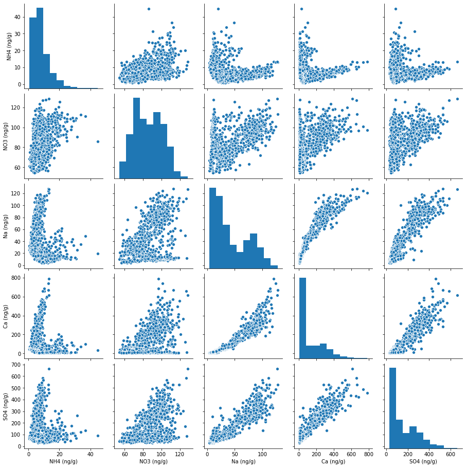
For example, we can use Seaborn to quickly plot pairwise relationships in the ice core dataset (as selected and grouped in subsection 4.2.4) using the single Python statement:
sns.pairplot(groupedSelectSuppData[['NH4 (ng/g)', 'NO3 (ng/g)', 'Na (ng/g)',
                                  'Ca (ng/g)', 'SO4 (ng/g)']].dropna())
<seaborn.axisgrid.PairGrid at 0x7f109068cf10>
Getting started with Matplotlib#
In this notebook, we will use Matplotlib to programmatically create a
specialized figure with subplots and customized axes. By convention,
Matplotlib’s pyplot and ticker APIs are imported using the
statements:
import matplotlib.pyplot as plt
import matplotlib.ticker as ticker
These namespaces can be explored by removing the # and entering a tab at the end of the lines:
#plt.
#ticker.
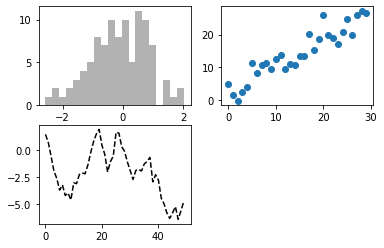
In Matplotlib, a figure contains subplots arranged in a grid, as shown in this example from Chapter 9 of Python for Data Analysis: Data Wrangling with Pandas, NumPy, and IPython, Second Edition, by Wes McKinney (O’Reilly, September 2018) [2]. Unless otherwise specified, data are plotted on the most recently created subplot, as in the line
plt.plot(np.random.randn(50).cumsum(), 'k--')
which plots points on the third subplot, ax3, just created in the preceding line. To select a subplot on which to plot data, use the name of the subplot, as shown in the final two lines:
ax1.hist(np.random.randn(100), bins=20, color='k', alpha=0.3)
ax2.scatter(np.arange(30), np.arange(30) + 3 * np.random.randn(30))
fig = plt.figure()
ax1 = fig.add_subplot(2,2,1)
ax2 = fig.add_subplot(2,2,2)
ax3 = fig.add_subplot(2,2,3)
plt.plot(np.random.randn(50).cumsum(), 'k--')
ax1.hist(np.random.randn(100), bins=20, color='k', alpha=0.3)
ax2.scatter(np.arange(30), np.arange(30) + 3 * np.random.randn(30))
<matplotlib.collections.PathCollection at 0x7f108a478c70>
Part 1: Recreate Figure 2, step-by-step, with intermediate results#
In this section, we will create a reasonable facimile of Figure 2, as published in Nature Communications, one step at a time, showing the resulting figure after each step.
Figure 2 (as published in Nature Communications [4]) |
The resulting facimile of Figure 2 |
|---|---|
|
|
Step 1: Prepare the data and initialize the figure with four empty axes#
Figure 2 uses only Supplentary Data 2, which we’ve already read into a DataFrame in subsection 4.2.4.
supp_data_2
| depth_top (m) | depth_bott (m) | depth_mid (m) | ageGICC05ext_top (yr BP) | ageGICC05ext_bott (yr BP) | ageGICC05_mid (yr BP) | NH4source (ng/m3) | NH4source+1sigma (ng/m3) | NH4source-1sigma (ng/m3) | NH4 atm. residence time (days) | Nasource (ng/m3) | Nasource+1sigma (ng/m3) | Nasource-1sigma (ng/m3) | Na atm. residence time (days) | Casource (ng/m3) | Casource+1sigma (ng/m3) | Casource-1sigma (ng/m3) | Ca atm. residence time (days) | |
|---|---|---|---|---|---|---|---|---|---|---|---|---|---|---|---|---|---|---|
| 0 | 1135.6400 | 1136.6575 | 1136.1488 | 7185.0000 | 7194.9119 | 7189.9559 | 35.548 | 66.914 | 4.1827 | 4.76 | 232.92 | 582.70 | -116.86 | 1.59 | 33.85 | 82.68 | -14.98 | 7.12 |
| 1 | 1136.6575 | 1137.6295 | 1137.1435 | 7194.9119 | 7205.0488 | 7199.9803 | 11.800 | 22.243 | 1.3565 | 4.74 | 185.62 | 465.66 | -94.42 | 1.58 | 11.70 | 28.64 | -5.25 | 7.10 |
| 2 | 1137.6295 | 1138.5920 | 1138.1108 | 7205.0488 | 7215.0036 | 7210.0262 | 37.856 | 71.542 | 4.1694 | 4.70 | 161.75 | 407.77 | -84.26 | 1.57 | 20.02 | 49.24 | -9.20 | 7.06 |
| 3 | 1138.5920 | 1139.5085 | 1139.0503 | 7215.0036 | 7225.0018 | 7220.0027 | 56.530 | 106.980 | 6.0802 | 4.68 | 140.98 | 356.32 | -74.36 | 1.56 | 19.02 | 46.90 | -8.86 | 7.04 |
| 4 | 1139.5085 | 1140.4435 | 1139.9760 | 7225.0018 | 7235.1555 | 7230.0787 | 49.152 | 93.035 | 5.2689 | 4.67 | 123.39 | 311.95 | -65.16 | 1.56 | 20.48 | 50.53 | -9.57 | 7.04 |
| ... | ... | ... | ... | ... | ... | ... | ... | ... | ... | ... | ... | ... | ... | ... | ... | ... | ... | ... |
| 11441 | 2431.6630 | 2431.7880 | 2431.7255 | 128575.0400 | 128585.0400 | 128580.0400 | NaN | NaN | NaN | NaN | NaN | NaN | NaN | NaN | NaN | NaN | NaN | NaN |
| 11442 | 2431.7880 | 2431.9130 | 2431.8505 | 128585.0400 | 128595.0400 | 128590.0400 | NaN | NaN | NaN | NaN | NaN | NaN | NaN | NaN | NaN | NaN | NaN | NaN |
| 11443 | 2431.9130 | 2432.0460 | 2431.9795 | 128595.0400 | 128605.1227 | 128600.0814 | NaN | NaN | NaN | NaN | NaN | NaN | NaN | NaN | NaN | NaN | NaN | NaN |
| 11444 | 2432.0460 | 2432.1535 | 2432.0998 | 128605.1227 | 128612.5026 | 128608.8127 | NaN | NaN | NaN | NaN | NaN | NaN | NaN | NaN | NaN | NaN | NaN | NaN |
| 11445 | 2432.1535 | 2432.2610 | 2432.2073 | 128612.5026 | 128619.8825 | 128616.1926 | NaN | NaN | NaN | NaN | NaN | NaN | NaN | NaN | NaN | NaN | NaN | NaN |
11446 rows × 18 columns
Listing the column names shows that Supplentary Data 2 lacks a column for age in kyr, so first create a new column and add it to the DataFrame.
supp_data_2.columns
Index(['depth_top (m)', 'depth_bott (m)', 'depth_mid (m)',
       'ageGICC05ext_top (yr BP)', 'ageGICC05ext_bott (yr BP)',
       'ageGICC05_mid (yr BP)', 'NH4source (ng/m3)',
       'NH4source+1sigma (ng/m3)', 'NH4source-1sigma (ng/m3)',
       'NH4 atm. residence time (days)', 'Nasource (ng/m3)',
       'Nasource+1sigma (ng/m3)', 'Nasource-1sigma (ng/m3)',
       'Na atm. residence time (days)', 'Casource (ng/m3)',
       'Casource+1sigma (ng/m3)', 'Casource-1sigma (ng/m3)',
       'Ca atm. residence time (days)'],
      dtype='object')
# Add column for age in kyr to the DataFrame.
supp_data_2['age_kyr'] = supp_data_2['ageGICC05_mid (yr BP)'] / 1000
Now, listing the columns and viewing the dataset confirm that the new column for kyr has been added.
supp_data_2.columns
Index(['depth_top (m)', 'depth_bott (m)', 'depth_mid (m)',
       'ageGICC05ext_top (yr BP)', 'ageGICC05ext_bott (yr BP)',
       'ageGICC05_mid (yr BP)', 'NH4source (ng/m3)',
       'NH4source+1sigma (ng/m3)', 'NH4source-1sigma (ng/m3)',
       'NH4 atm. residence time (days)', 'Nasource (ng/m3)',
       'Nasource+1sigma (ng/m3)', 'Nasource-1sigma (ng/m3)',
       'Na atm. residence time (days)', 'Casource (ng/m3)',
       'Casource+1sigma (ng/m3)', 'Casource-1sigma (ng/m3)',
       'Ca atm. residence time (days)', 'age_kyr'],
      dtype='object')
supp_data_2
| depth_top (m) | depth_bott (m) | depth_mid (m) | ageGICC05ext_top (yr BP) | ageGICC05ext_bott (yr BP) | ageGICC05_mid (yr BP) | NH4source (ng/m3) | NH4source+1sigma (ng/m3) | NH4source-1sigma (ng/m3) | NH4 atm. residence time (days) | Nasource (ng/m3) | Nasource+1sigma (ng/m3) | Nasource-1sigma (ng/m3) | Na atm. residence time (days) | Casource (ng/m3) | Casource+1sigma (ng/m3) | Casource-1sigma (ng/m3) | Ca atm. residence time (days) | age_kyr | |
|---|---|---|---|---|---|---|---|---|---|---|---|---|---|---|---|---|---|---|---|
| 0 | 1135.6400 | 1136.6575 | 1136.1488 | 7185.0000 | 7194.9119 | 7189.9559 | 35.548 | 66.914 | 4.1827 | 4.76 | 232.92 | 582.70 | -116.86 | 1.59 | 33.85 | 82.68 | -14.98 | 7.12 | 7.189956 |
| 1 | 1136.6575 | 1137.6295 | 1137.1435 | 7194.9119 | 7205.0488 | 7199.9803 | 11.800 | 22.243 | 1.3565 | 4.74 | 185.62 | 465.66 | -94.42 | 1.58 | 11.70 | 28.64 | -5.25 | 7.10 | 7.199980 |
| 2 | 1137.6295 | 1138.5920 | 1138.1108 | 7205.0488 | 7215.0036 | 7210.0262 | 37.856 | 71.542 | 4.1694 | 4.70 | 161.75 | 407.77 | -84.26 | 1.57 | 20.02 | 49.24 | -9.20 | 7.06 | 7.210026 |
| 3 | 1138.5920 | 1139.5085 | 1139.0503 | 7215.0036 | 7225.0018 | 7220.0027 | 56.530 | 106.980 | 6.0802 | 4.68 | 140.98 | 356.32 | -74.36 | 1.56 | 19.02 | 46.90 | -8.86 | 7.04 | 7.220003 |
| 4 | 1139.5085 | 1140.4435 | 1139.9760 | 7225.0018 | 7235.1555 | 7230.0787 | 49.152 | 93.035 | 5.2689 | 4.67 | 123.39 | 311.95 | -65.16 | 1.56 | 20.48 | 50.53 | -9.57 | 7.04 | 7.230079 |
| ... | ... | ... | ... | ... | ... | ... | ... | ... | ... | ... | ... | ... | ... | ... | ... | ... | ... | ... | ... |
| 11441 | 2431.6630 | 2431.7880 | 2431.7255 | 128575.0400 | 128585.0400 | 128580.0400 | NaN | NaN | NaN | NaN | NaN | NaN | NaN | NaN | NaN | NaN | NaN | NaN | 128.580040 |
| 11442 | 2431.7880 | 2431.9130 | 2431.8505 | 128585.0400 | 128595.0400 | 128590.0400 | NaN | NaN | NaN | NaN | NaN | NaN | NaN | NaN | NaN | NaN | NaN | NaN | 128.590040 |
| 11443 | 2431.9130 | 2432.0460 | 2431.9795 | 128595.0400 | 128605.1227 | 128600.0814 | NaN | NaN | NaN | NaN | NaN | NaN | NaN | NaN | NaN | NaN | NaN | NaN | 128.600081 |
| 11444 | 2432.0460 | 2432.1535 | 2432.0998 | 128605.1227 | 128612.5026 | 128608.8127 | NaN | NaN | NaN | NaN | NaN | NaN | NaN | NaN | NaN | NaN | NaN | NaN | 128.608813 |
| 11445 | 2432.1535 | 2432.2610 | 2432.2073 | 128612.5026 | 128619.8825 | 128616.1926 | NaN | NaN | NaN | NaN | NaN | NaN | NaN | NaN | NaN | NaN | NaN | NaN | 128.616193 |
11446 rows × 19 columns
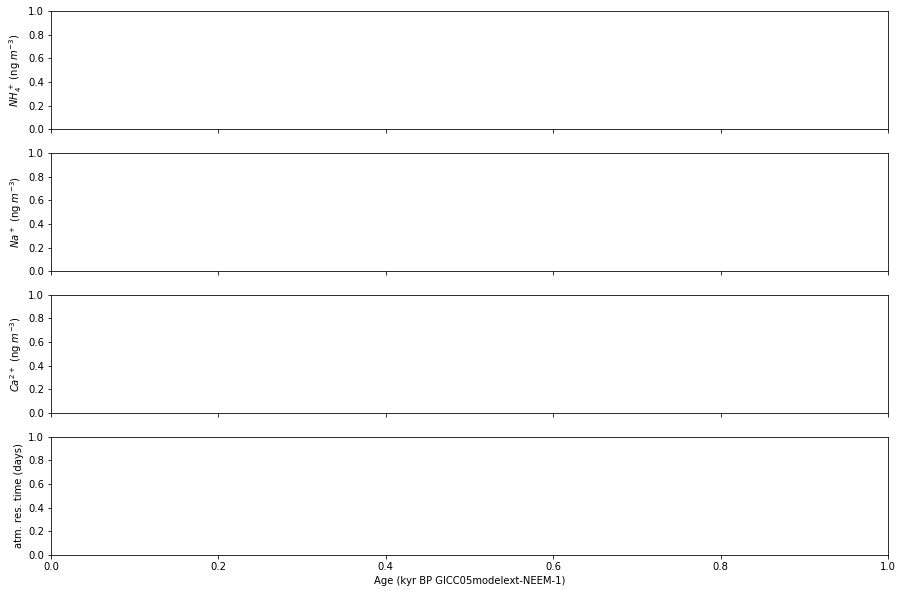
Now that the data has been prepared, create a new figure with four subplots. Matplotlib supports a subset of latex, so we can use familiar latex format to label the y-axes. For more, see the Matplotlib documentation: https://matplotlib.org/stable/tutorials/text/mathtext.html
# Figure 2
# Create a new figure with four subplots.
fig, axes = plt.subplots(4, 1, sharex=True, figsize=(15,10))

# Set labels directly on the axes objects. Matplotlib supports a subset of latex.
# See https://matplotlib.org/stable/tutorials/text/mathtext.html for documentation.
axes[0].set_ylabel(r'$NH_4^+$ (ng $m^{-3}$)')
axes[1].set_ylabel(r'$Na^+$ (ng $m^{-3}$)', )
axes[2].set_ylabel(r'$Ca^{2+}$ (ng $m^{-3}$)')
axes[3].set_ylabel('atm. res. time (days)')

axes[3].set_xlabel('Age (kyr BP GICC05modelext-NEEM-1)')
Text(0.5, 0, 'Age (kyr BP GICC05modelext-NEEM-1)')
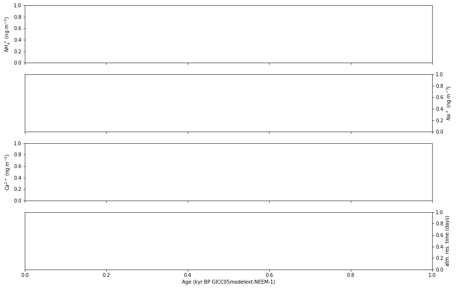
Step 2: Position the y-axis labels and tick marks#
The 2nd and 4th plots should have y-axis labels and tick marks on the right using the Python code:
for i in [1, 3]:
    axes[i].yaxis.set_label_position('right')
    axes[i].tick_params(which='both', left=False, right=True,
                        labelleft=False, labelright=True)
Note that in this and each of the following steps, the newly added code is highlighted by ‘##########’ both above and below.
# Figure 2
# Create a new figure with four subplots.
fig, axes = plt.subplots(4, 1, sharex=True, figsize=(15,10))

###############################################################################
# The 2nd and 4th plots have y-axis labels and tick marks on the right.
for i in [1, 3]:
    axes[i].yaxis.set_label_position('right')
    axes[i].tick_params(which='both', left=False, right=True,
                        labelleft=False, labelright=True)
###############################################################################

# Set labels directly on the axes objects. Matplotlib supports a subset of latex.
# See https://matplotlib.org/stable/tutorials/text/mathtext.html for documentation.
axes[0].set_ylabel(r'$NH_4^+$ (ng $m^{-3}$)')
axes[1].set_ylabel(r'$Na^+$ (ng $m^{-3}$)', )
axes[2].set_ylabel(r'$Ca^{2+}$ (ng $m^{-3}$)')
axes[3].set_ylabel('atm. res. time (days)')

axes[3].set_xlabel('Age (kyr BP GICC05modelext-NEEM-1)')
Text(0.5, 0, 'Age (kyr BP GICC05modelext-NEEM-1)')
Step 3: Remove unnecessary spines#
Next, we remove lines (spines) that don’t appear in Figure 2 as published in Nature by adding:
for i in [0, 2]:
    axes[i].spines['right'].set_visible(False)
for i in [1, 3]:
    axes[i].spines['left'].set_visible(False)
for i in [0, 1, 2]:
    axes[i].spines['bottom'].set_visible(False)
for i in [1, 2, 3]:
    axes[i].spines['top'].set_visible(False)
# Figure 2
# Create a new figure with four subplots.
fig, axes = plt.subplots(4, 1, sharex=True, figsize=(15,10))

# Set labels directly on the axes objects. Matplotlib supports a subset of latex.
# See https://matplotlib.org/stable/tutorials/text/mathtext.html for documentation.
axes[0].set_ylabel(r'$NH_4^+$ (ng $m^{-3}$)')
axes[1].set_ylabel(r'$Na^+$ (ng $m^{-3}$)', )
axes[2].set_ylabel(r'$Ca^{2+}$ (ng $m^{-3}$)')
axes[3].set_ylabel('atm. res. time (days)')

axes[3].set_xlabel('Age (kyr BP GICC05modelext-NEEM-1)')

# The 2nd and 4th plots have y-axis labels and tick marks on the right.
for i in [1, 3]:
    axes[i].yaxis.set_label_position('right')
    axes[i].tick_params(which='both', left=False, right=True,
                        labelleft=False, labelright=True)

###############################################################################
# Remove lines that don't appear in Figure 2 as published in Nature.
for i in [0, 2]:
    axes[i].spines['right'].set_visible(False)
for i in [1, 3]:
    axes[i].spines['left'].set_visible(False)
for i in [0, 1, 2]:
    axes[i].spines['bottom'].set_visible(False)
for i in [1, 2, 3]:
    axes[i].spines['top'].set_visible(False)
###############################################################################
Step 4: Configure the tick marks#
To draw the tick marks inside the plot area, we adjust the tick_params by setting the direction to ‘in’:
for i in range(4):
    axes[i].tick_params(which='both', direction='in')
# Figure 2
# Create a new figure with four subplots.
fig, axes = plt.subplots(4, 1, sharex=True, figsize=(15,10))

###############################################################################
# Draw all tick marks inside the plot area.
for i in range(4):
    axes[i].tick_params(which='both', direction='in')
###############################################################################

# The 2nd and 4th plots have y-axis labels and tick marks on the right.
for i in [1, 3]:
    axes[i].yaxis.set_label_position('right')
    axes[i].tick_params(which='both', left=False, right=True,
                        labelleft=False, labelright=True)

# Remove lines that don't appear in Figure 2 as published in Nature.
for i in [0, 2]:
    axes[i].spines['right'].set_visible(False)
for i in [1, 3]:
    axes[i].spines['left'].set_visible(False)
for i in [0, 1, 2]:
    axes[i].spines['bottom'].set_visible(False)
for i in [1, 2, 3]:
    axes[i].spines['top'].set_visible(False)

# Set labels directly on the axes objects. Matplotlib supports a subset of latex.
# See https://matplotlib.org/stable/tutorials/text/mathtext.html for documentation.
axes[0].set_ylabel(r'$NH_4^+$ (ng $m^{-3}$)')
axes[1].set_ylabel(r'$Na^+$ (ng $m^{-3}$)', )
axes[2].set_ylabel(r'$Ca^{2+}$ (ng $m^{-3}$)')
axes[3].set_ylabel('atm. res. time (days)')

axes[3].set_xlabel('Age (kyr BP GICC05modelext-NEEM-1)')
Text(0.5, 0, 'Age (kyr BP GICC05modelext-NEEM-1)')
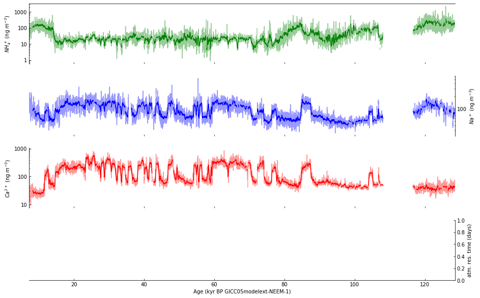
Step 5: Plot data in subplots a-c#
Plot the data in subplots a-c using a lighter shade (by setting alpha=0.4) of each selected color:
supp_data_2.plot(ax=axes[0], x='age_kyr', y='NH4source (ng/m3)',
                 color='green', alpha=0.4, legend=False)
supp_data_2.plot(ax=axes[1], x='age_kyr', y='Nasource (ng/m3)',
                 color='blue', alpha=0.4, legend=False)
supp_data_2.plot(ax=axes[2], x='age_kyr', y='Casource (ng/m3)',
                 color='red', alpha=0.4, legend=False)
# Figure 2
# Create a new figure with four subplots.
fig, axes = plt.subplots(4, 1, sharex=True, figsize=(15,10))

# Draw all tick marks inside the plot area.
for i in range(4):
    axes[i].tick_params(which='both', direction='in')

# The 2nd and 4th plots have y-axis labels and tick marks on the right.
for i in [1, 3]:
    axes[i].yaxis.set_label_position('right')
    axes[i].tick_params(which='both', left=False, right=True,
                        labelleft=False, labelright=True)

# Remove lines that don't appear in Figure 2 as published in Nature.
for i in [0, 2]:
    axes[i].spines['right'].set_visible(False)
for i in [1, 3]:
    axes[i].spines['left'].set_visible(False)
for i in [0, 1, 2]:
    axes[i].spines['bottom'].set_visible(False)
for i in [1, 2, 3]:
    axes[i].spines['top'].set_visible(False)

###############################################################################
# Plot data using a lighter shade (by setting alpha=0.4).
supp_data_2.plot(ax=axes[0], x='age_kyr', y='NH4source (ng/m3)',
                 color='green', alpha=0.4, legend=False)
supp_data_2.plot(ax=axes[1], x='age_kyr', y='Nasource (ng/m3)',
                 color='blue', alpha=0.4, legend=False)
supp_data_2.plot(ax=axes[2], x='age_kyr', y='Casource (ng/m3)',
                 color='red', alpha=0.4, legend=False)
###############################################################################

# Set labels directly on the axes objects. Matplotlib supports a subset of latex.
# See https://matplotlib.org/stable/tutorials/text/mathtext.html for documentation.
axes[0].set_ylabel(r'$NH_4^+$ (ng $m^{-3}$)')
axes[1].set_ylabel(r'$Na^+$ (ng $m^{-3}$)', )
axes[2].set_ylabel(r'$Ca^{2+}$ (ng $m^{-3}$)')
axes[3].set_ylabel('atm. res. time (days)')

axes[3].set_xlabel('Age (kyr BP GICC05modelext-NEEM-1)')
Text(0.5, 0, 'Age (kyr BP GICC05modelext-NEEM-1)')
Step 6: Use a log scale for selected subplots#
Next, we use a log scale for the y-axis of subplots a-c, but we don’t use exponential format for the y-axis labels:
for i in range(3):
    axes[i].set_yscale('log')
    axes[i].yaxis.set_major_formatter(ticker.ScalarFormatter())
# Figure 2
# Create a new figure with four subplots.
fig, axes = plt.subplots(4, 1, sharex=True, figsize=(15,10))

# Draw all tick marks inside the plot area.
for i in range(4):
    axes[i].tick_params(which='both', direction='in')

###############################################################################
# Use log scale for y-axis in subplots a-c, but don't use exponential format
# for y-axis labels.
for i in range(3):
    axes[i].set_yscale('log')
    axes[i].yaxis.set_major_formatter(ticker.ScalarFormatter())
###############################################################################

# The 2nd and 4th plots have y-axis labels and tick marks on the right.
for i in [1, 3]:
    axes[i].yaxis.set_label_position('right')
    axes[i].tick_params(which='both', left=False, right=True,
                        labelleft=False, labelright=True)

# Remove lines that don't appear in Figure 2 as published in Nature.
for i in [0, 2]:
    axes[i].spines['right'].set_visible(False)
for i in [1, 3]:
    axes[i].spines['left'].set_visible(False)
for i in [0, 1, 2]:
    axes[i].spines['bottom'].set_visible(False)
for i in [1, 2, 3]:
    axes[i].spines['top'].set_visible(False)

# Plot data using a lighter shade (by setting alpha=0.4).
supp_data_2.plot(ax=axes[0], x='age_kyr', y='NH4source (ng/m3)',
                 color='green', alpha=0.4, legend=False)
supp_data_2.plot(ax=axes[1], x='age_kyr', y='Nasource (ng/m3)',
                 color='blue', alpha=0.4, legend=False)
supp_data_2.plot(ax=axes[2], x='age_kyr', y='Casource (ng/m3)',
                 color='red', alpha=0.4, legend=False)

# Set labels directly on the axes objects. Matplotlib supports a subset of latex.
# See https://matplotlib.org/stable/tutorials/text/mathtext.html for documentation.
axes[0].set_ylabel(r'$NH_4^+$ (ng $m^{-3}$)')
axes[1].set_ylabel(r'$Na^+$ (ng $m^{-3}$)', )
axes[2].set_ylabel(r'$Ca^{2+}$ (ng $m^{-3}$)')
axes[3].set_ylabel('atm. res. time (days)')

axes[3].set_xlabel('Age (kyr BP GICC05modelext-NEEM-1)')
Text(0.5, 0, 'Age (kyr BP GICC05modelext-NEEM-1)')
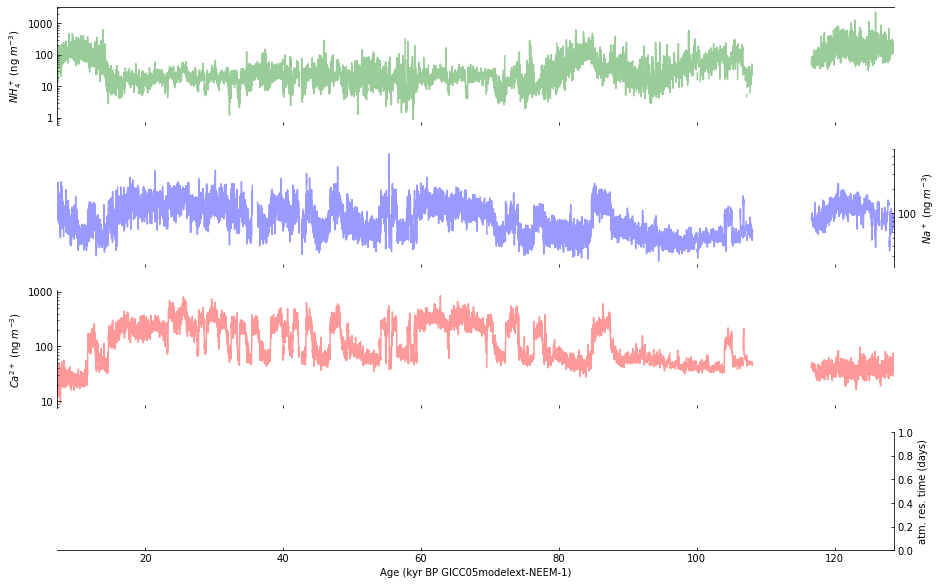
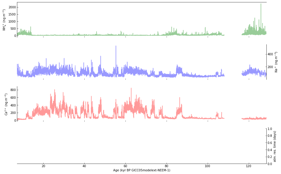
Step 7: Plot a running average#
Calculate and plot the smoothed function values using a darker line.
To do this, first we use min_periods to remove extraneous “mean” values when the actual data is “NaN”:
supp_data_2_smoothed = supp_data_2.rolling(21, min_periods=21, center=True)
supp_data_2_rolling_mean = supp_data_2_smoothed.mean()
Then, the smoothed function value is represented by plotting the 21 point running means of the 10 year data, as described in the caption for Figure 2, on page 4 of Schupbach et al. [4].
supp_data_2_rolling_mean.plot(ax=axes[0], x='age_kyr', y='NH4source (ng/m3)',
                              color='green', legend=False)
supp_data_2_rolling_mean.plot(ax=axes[1], x='age_kyr', y='Nasource (ng/m3)',
                              color='blue', legend=False)
supp_data_2_rolling_mean.plot(ax=axes[2], x='age_kyr', y='Casource (ng/m3)',
                              color='red', legend=False)
supp_data_2_smoothed = supp_data_2.rolling(21, min_periods=21, center=True)
supp_data_2_rolling_mean = supp_data_2_smoothed.mean()
supp_data_2_rolling_mean
| depth_top (m) | depth_bott (m) | depth_mid (m) | ageGICC05ext_top (yr BP) | ageGICC05ext_bott (yr BP) | ageGICC05_mid (yr BP) | NH4source (ng/m3) | NH4source+1sigma (ng/m3) | NH4source-1sigma (ng/m3) | NH4 atm. residence time (days) | Nasource (ng/m3) | Nasource+1sigma (ng/m3) | Nasource-1sigma (ng/m3) | Na atm. residence time (days) | Casource (ng/m3) | Casource+1sigma (ng/m3) | Casource-1sigma (ng/m3) | Ca atm. residence time (days) | age_kyr | |
|---|---|---|---|---|---|---|---|---|---|---|---|---|---|---|---|---|---|---|---|
| 0 | NaN | NaN | NaN | NaN | NaN | NaN | NaN | NaN | NaN | NaN | NaN | NaN | NaN | NaN | NaN | NaN | NaN | NaN | NaN |
| 1 | NaN | NaN | NaN | NaN | NaN | NaN | NaN | NaN | NaN | NaN | NaN | NaN | NaN | NaN | NaN | NaN | NaN | NaN | NaN |
| 2 | NaN | NaN | NaN | NaN | NaN | NaN | NaN | NaN | NaN | NaN | NaN | NaN | NaN | NaN | NaN | NaN | NaN | NaN | NaN |
| 3 | NaN | NaN | NaN | NaN | NaN | NaN | NaN | NaN | NaN | NaN | NaN | NaN | NaN | NaN | NaN | NaN | NaN | NaN | NaN |
| 4 | NaN | NaN | NaN | NaN | NaN | NaN | NaN | NaN | NaN | NaN | NaN | NaN | NaN | NaN | NaN | NaN | NaN | NaN | NaN |
| ... | ... | ... | ... | ... | ... | ... | ... | ... | ... | ... | ... | ... | ... | ... | ... | ... | ... | ... | ... |
| 11441 | NaN | NaN | NaN | NaN | NaN | NaN | NaN | NaN | NaN | NaN | NaN | NaN | NaN | NaN | NaN | NaN | NaN | NaN | NaN |
| 11442 | NaN | NaN | NaN | NaN | NaN | NaN | NaN | NaN | NaN | NaN | NaN | NaN | NaN | NaN | NaN | NaN | NaN | NaN | NaN |
| 11443 | NaN | NaN | NaN | NaN | NaN | NaN | NaN | NaN | NaN | NaN | NaN | NaN | NaN | NaN | NaN | NaN | NaN | NaN | NaN |
| 11444 | NaN | NaN | NaN | NaN | NaN | NaN | NaN | NaN | NaN | NaN | NaN | NaN | NaN | NaN | NaN | NaN | NaN | NaN | NaN |
| 11445 | NaN | NaN | NaN | NaN | NaN | NaN | NaN | NaN | NaN | NaN | NaN | NaN | NaN | NaN | NaN | NaN | NaN | NaN | NaN |
11446 rows × 19 columns
# Figure 2
# Create a new figure with four subplots.
fig, axes = plt.subplots(4, 1, sharex=True, figsize=(15,10))

# Draw all tick marks inside the plot area.
for i in range(4):
    axes[i].tick_params(which='both', direction='in')

# Use log scale for y-axis in subplots a-c, but don't use exponential format
# for y-axis labels.
for i in range(3):
    axes[i].set_yscale('log')
    axes[i].yaxis.set_major_formatter(ticker.ScalarFormatter())

# The 2nd and 4th plots have y-axis labels and tick marks on the right.
for i in [1, 3]:
    axes[i].yaxis.set_label_position('right')
    axes[i].tick_params(which='both', left=False, right=True,
                        labelleft=False, labelright=True)

# Remove lines that don't appear in Figure 2 as published in Nature.
for i in [0, 2]:
    axes[i].spines['right'].set_visible(False)
for i in [1, 3]:
    axes[i].spines['left'].set_visible(False)
for i in [0, 1, 2]:
    axes[i].spines['bottom'].set_visible(False)
for i in [1, 2, 3]:
    axes[i].spines['top'].set_visible(False)

# Plot data using a lighter shade (by setting alpha=0.4).
supp_data_2.plot(ax=axes[0], x='age_kyr', y='NH4source (ng/m3)',
                 color='green', alpha=0.4, legend=False)
supp_data_2.plot(ax=axes[1], x='age_kyr', y='Nasource (ng/m3)',
                 color='blue', alpha=0.4, legend=False)
supp_data_2.plot(ax=axes[2], x='age_kyr', y='Casource (ng/m3)',
                 color='red', alpha=0.4, legend=False)

###############################################################################
# Calculate and plot the smoothed function values using a darker line.
# Use min_periods to remove extraneous "mean" values when the actual data
# is "NaN".
supp_data_2_smoothed = supp_data_2.rolling(21, min_periods=21, center=True)
supp_data_2_rolling_mean = supp_data_2_smoothed.mean()

# Plot the 21 point running means of the 10 year data.
supp_data_2_rolling_mean.plot(ax=axes[0], x='age_kyr', y='NH4source (ng/m3)',
                              color='green', legend=False)
supp_data_2_rolling_mean.plot(ax=axes[1], x='age_kyr', y='Nasource (ng/m3)',
                              color='blue', legend=False)
supp_data_2_rolling_mean.plot(ax=axes[2], x='age_kyr', y='Casource (ng/m3)',
                              color='red', legend=False)
###############################################################################

# Set labels directly on the axes objects. Matplotlib supports a subset of latex.
# See https://matplotlib.org/stable/tutorials/text/mathtext.html for documentation.
axes[0].set_ylabel(r'$NH_4^+$ (ng $m^{-3}$)')
axes[1].set_ylabel(r'$Na^+$ (ng $m^{-3}$)', )
axes[2].set_ylabel(r'$Ca^{2+}$ (ng $m^{-3}$)')
axes[3].set_ylabel('atm. res. time (days)')

axes[3].set_xlabel('Age (kyr BP GICC05modelext-NEEM-1)')
Text(0.5, 0, 'Age (kyr BP GICC05modelext-NEEM-1)')
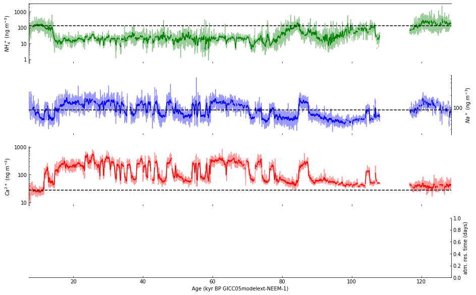
Step 8: Draw horizonal dashed lines#
Next, we plot the dashed lines indicating the early Holocene average, using dates selected based on the title of Figure 3, on page 6 of Schupbach et al. [4].
Before modifying the code, we first explore how to find the mean of each column of interest.
early_hol_data_2 = (
    supp_data_2[(supp_data_2.age_kyr >= 7.6) & (supp_data_2.age_kyr <= 9.8)]
               [['NH4source (ng/m3)', 'Nasource (ng/m3)', 'Casource (ng/m3)']])
early_hol_data_2.mean()
NH4source (ng/m3)    127.979238
Nasource (ng/m3)      88.577290
Casource (ng/m3)      27.611878
dtype: float64
Then, based on the exploration above, we modify the code by adding:
early_hol_data_2 = (
    supp_data_2[(supp_data_2.age_kyr >= 7.6) & (supp_data_2.age_kyr <= 9.8)]
               [['NH4source (ng/m3)', 'Nasource (ng/m3)', 'Casource (ng/m3)']])
early_hol_mean = early_hol_data_2.mean()
axes[0].axhline(y=early_hol_mean['NH4source (ng/m3)'],
                color='black', linestyle='--')
axes[1].axhline(y=early_hol_mean['Nasource (ng/m3)'],
                color='black', linestyle='--')
axes[2].axhline(y=early_hol_mean['Casource (ng/m3)'],
                color='black', linestyle='--')
# Figure 2
# Create a new figure with four subplots.
fig, axes = plt.subplots(4, 1, sharex=True, figsize=(15,10))

# Draw all tick marks inside the plot area.
for i in range(4):
    axes[i].tick_params(which='both', direction='in')

# Use log scale for y-axis in subplots a-c, but don't use exponential format
# for y-axis labels.
for i in range(3):
    axes[i].set_yscale('log')
    axes[i].yaxis.set_major_formatter(ticker.ScalarFormatter())

# The 2nd and 4th plots have y-axis labels and tick marks on the right.
for i in [1, 3]:
    axes[i].yaxis.set_label_position('right')
    axes[i].tick_params(which='both', left=False, right=True,
                        labelleft=False, labelright=True)

# Remove lines that don't appear in Figure 2 as published in Nature.
for i in [0, 2]:
    axes[i].spines['right'].set_visible(False)
for i in [1, 3]:
    axes[i].spines['left'].set_visible(False)
for i in [0, 1, 2]:
    axes[i].spines['bottom'].set_visible(False)
for i in [1, 2, 3]:
    axes[i].spines['top'].set_visible(False)

# Plot data using a lighter shade (by setting alpha=0.4).
supp_data_2.plot(ax=axes[0], x='age_kyr', y='NH4source (ng/m3)',
                 color='green', alpha=0.4, legend=False)
supp_data_2.plot(ax=axes[1], x='age_kyr', y='Nasource (ng/m3)',
                 color='blue', alpha=0.4, legend=False)
supp_data_2.plot(ax=axes[2], x='age_kyr', y='Casource (ng/m3)',
                 color='red', alpha=0.4, legend=False)

# Calculate and plot the smoothed function values using a darker line.
# Use min_periods to remove extraneous "mean" values when the actual data
# is "NaN".
supp_data_2_smoothed = supp_data_2.rolling(21, min_periods=21, center=True)
supp_data_2_rolling_mean = supp_data_2_smoothed.mean()

# Plot the 21 point running means of the 10 year data.
supp_data_2_rolling_mean.plot(ax=axes[0], x='age_kyr', y='NH4source (ng/m3)',
                              color='green', legend=False)
supp_data_2_rolling_mean.plot(ax=axes[1], x='age_kyr', y='Nasource (ng/m3)',
                              color='blue', legend=False)
supp_data_2_rolling_mean.plot(ax=axes[2], x='age_kyr', y='Casource (ng/m3)',
                              color='red', legend=False)
###############################################################################
# Plot the dashed lines indicating the early Holocene average.
# Dates selected based on the title of Figure 3.
early_hol_data_2 = (
    supp_data_2[(supp_data_2.age_kyr >= 7.6) & (supp_data_2.age_kyr <= 9.8)]
               [['NH4source (ng/m3)', 'Nasource (ng/m3)', 'Casource (ng/m3)']])
early_hol_mean = early_hol_data_2.mean()
axes[0].axhline(y=early_hol_mean['NH4source (ng/m3)'],
                color='black', linestyle='--')
axes[1].axhline(y=early_hol_mean['Nasource (ng/m3)'],
                color='black', linestyle='--')
axes[2].axhline(y=early_hol_mean['Casource (ng/m3)'],
                color='black', linestyle='--')
###############################################################################

# Set labels directly on the axes objects. Matplotlib supports a subset of latex.
# See https://matplotlib.org/stable/tutorials/text/mathtext.html for documentation.
axes[0].set_ylabel(r'$NH_4^+$ (ng $m^{-3}$)')
axes[1].set_ylabel(r'$Na^+$ (ng $m^{-3}$)', )
axes[2].set_ylabel(r'$Ca^{2+}$ (ng $m^{-3}$)')
axes[3].set_ylabel('atm. res. time (days)')

axes[3].set_xlabel('Age (kyr BP GICC05modelext-NEEM-1)')
Text(0.5, 0, 'Age (kyr BP GICC05modelext-NEEM-1)')
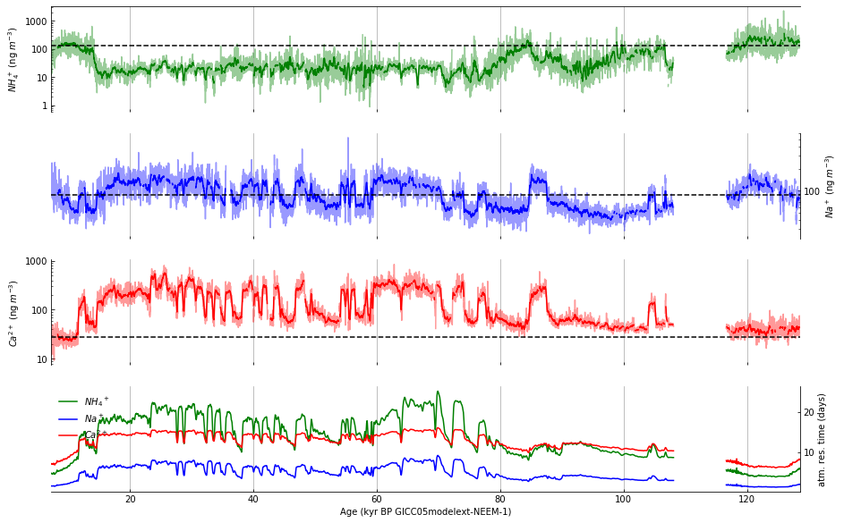
Step 9: Plot data in subplot d#
The fourth subplot is a bit different from the first three. Rather than a single value plotted with a running average, subplot d will have three values, plotted as colored lines together with a legend to identify them. Although the results of this cell produce a legend that is obscured by the plotted lines, we will fix this soon.
supp_data_2.plot(ax=axes[3], x='age_kyr', y='NH4 atm. residence time (days)',
                 color='green', label='${NH_4}^+$')
supp_data_2.plot(ax=axes[3], x='age_kyr', y='Na atm. residence time (days)',
                 color='blue', label='$Na^+$')
supp_data_2.plot(ax=axes[3], x='age_kyr', y='Ca atm. residence time (days)',
                 color='red', label='$Ca^{2+}$')
axes[3].legend(loc='upper left', frameon=False)
# Figure 2
# Create a new figure with four subplots.
fig, axes = plt.subplots(4, 1, sharex=True, figsize=(15,10))

# Draw all tick marks inside the plot area.
for i in range(4):
    axes[i].tick_params(which='both', direction='in')

# Use log scale for y-axis in subplots a-c, but don't use exponential format
# for y-axis labels.
for i in range(3):
    axes[i].set_yscale('log')
    axes[i].yaxis.set_major_formatter(ticker.ScalarFormatter())

# The 2nd and 4th plots have y-axis labels and tick marks on the right.
for i in [1, 3]:
    axes[i].yaxis.set_label_position('right')
    axes[i].tick_params(which='both', left=False, right=True,
                        labelleft=False, labelright=True)

# Remove lines that don't appear in Figure 2 as published in Nature.
for i in [0, 2]:
    axes[i].spines['right'].set_visible(False)
for i in [1, 3]:
    axes[i].spines['left'].set_visible(False)
for i in [0, 1, 2]:
    axes[i].spines['bottom'].set_visible(False)
for i in [1, 2, 3]:
    axes[i].spines['top'].set_visible(False)

# Plot data using a lighter shade (by setting alpha=0.4).
supp_data_2.plot(ax=axes[0], x='age_kyr', y='NH4source (ng/m3)',
                 color='green', alpha=0.4, legend=False)
supp_data_2.plot(ax=axes[1], x='age_kyr', y='Nasource (ng/m3)',
                 color='blue', alpha=0.4, legend=False)
supp_data_2.plot(ax=axes[2], x='age_kyr', y='Casource (ng/m3)',
                 color='red', alpha=0.4, legend=False)

# Calculate and plot the smoothed function values using a darker line.
# Use min_periods to remove extraneous "mean" values when the actual data
# is "NaN".
supp_data_2_smoothed = supp_data_2.rolling(21, min_periods=21, center=True)
supp_data_2_rolling_mean = supp_data_2_smoothed.mean()

# Plot the 21 point running means of the 10 year data.
supp_data_2_rolling_mean.plot(ax=axes[0], x='age_kyr', y='NH4source (ng/m3)',
                              color='green', legend=False)
supp_data_2_rolling_mean.plot(ax=axes[1], x='age_kyr', y='Nasource (ng/m3)',
                              color='blue', legend=False)
supp_data_2_rolling_mean.plot(ax=axes[2], x='age_kyr', y='Casource (ng/m3)',
                              color='red', legend=False)

# Plot the dashed lines indicating the early Holocene average.
# Dates selected based on the title of Figure 3.
early_hol_data_2 = (
    supp_data_2[(supp_data_2.age_kyr >= 7.6) & (supp_data_2.age_kyr <= 9.8)]
               [['NH4source (ng/m3)', 'Nasource (ng/m3)', 'Casource (ng/m3)']])
early_hol_mean = early_hol_data_2.mean()
axes[0].axhline(y=early_hol_mean['NH4source (ng/m3)'],
                color='black', linestyle='--')
axes[1].axhline(y=early_hol_mean['Nasource (ng/m3)'],
                color='black', linestyle='--')
axes[2].axhline(y=early_hol_mean['Casource (ng/m3)'],
                color='black', linestyle='--')

###############################################################################
# Subplot 2d.
supp_data_2.plot(ax=axes[3], x='age_kyr', y='NH4 atm. residence time (days)',
                 color='green', label='${NH_4}^+$')
supp_data_2.plot(ax=axes[3], x='age_kyr', y='Na atm. residence time (days)',
                 color='blue', label='$Na^+$')
supp_data_2.plot(ax=axes[3], x='age_kyr', y='Ca atm. residence time (days)',
                 color='red', label='$Ca^{2+}$')
axes[3].legend(loc='upper left', frameon=False)
###############################################################################

# Set labels directly on the axes objects. Matplotlib supports a subset of latex.
# See https://matplotlib.org/stable/tutorials/text/mathtext.html for documentation.
axes[0].set_ylabel(r'$NH_4^+$ (ng $m^{-3}$)')
axes[1].set_ylabel(r'$Na^+$ (ng $m^{-3}$)', )
axes[2].set_ylabel(r'$Ca^{2+}$ (ng $m^{-3}$)')
axes[3].set_ylabel('atm. res. time (days)')

axes[3].set_xlabel('Age (kyr BP GICC05modelext-NEEM-1)')
Text(0.5, 0, 'Age (kyr BP GICC05modelext-NEEM-1)')

Step 10: Draw vertical gridlines#
The first step in drawing the vertical gridlines consists of two for loops:
for i in range(4):
    axes[i].xaxis.grid(which='major')
for i in [0, 2]:
    axes[i].spines['right'].set_color('lightgrey')
# Figure 2
# Create a new figure with four subplots.
fig, axes = plt.subplots(4, 1, sharex=True, figsize=(15,10))

# Draw all tick marks inside the plot area.
for i in range(4):
    axes[i].tick_params(which='both', direction='in')

# Use log scale for y-axis in subplots a-c, but don't use exponential format
# for y-axis labels.
for i in range(3):
    axes[i].set_yscale('log')
    axes[i].yaxis.set_major_formatter(ticker.ScalarFormatter())

# The 2nd and 4th plots have y-axis labels and tick marks on the right.
for i in [1, 3]:
    axes[i].yaxis.set_label_position('right')
    axes[i].tick_params(which='both', left=False, right=True,
                        labelleft=False, labelright=True)

# Remove lines that don't appear in Figure 2 as published in Nature.
for i in [0, 2]:
    axes[i].spines['right'].set_visible(False)
for i in [1, 3]:
    axes[i].spines['left'].set_visible(False)
for i in [0, 1, 2]:
    axes[i].spines['bottom'].set_visible(False)
for i in [1, 2, 3]:
    axes[i].spines['top'].set_visible(False)

# Plot data using a lighter shade (by setting alpha=0.4).
supp_data_2.plot(ax=axes[0], x='age_kyr', y='NH4source (ng/m3)',
                 color='green', alpha=0.4, legend=False)
supp_data_2.plot(ax=axes[1], x='age_kyr', y='Nasource (ng/m3)',
                 color='blue', alpha=0.4, legend=False)
supp_data_2.plot(ax=axes[2], x='age_kyr', y='Casource (ng/m3)',
                 color='red', alpha=0.4, legend=False)

# Calculate and plot the smoothed function values using a darker line.
# Use min_periods to remove extraneous "mean" values when the actual data
# is "NaN".
supp_data_2_smoothed = supp_data_2.rolling(21, min_periods=21, center=True)
supp_data_2_rolling_mean = supp_data_2_smoothed.mean()

# Plot the 21 point running means of the 10 year data.
supp_data_2_rolling_mean.plot(ax=axes[0], x='age_kyr', y='NH4source (ng/m3)',
                              color='green', legend=False)
supp_data_2_rolling_mean.plot(ax=axes[1], x='age_kyr', y='Nasource (ng/m3)',
                              color='blue', legend=False)
supp_data_2_rolling_mean.plot(ax=axes[2], x='age_kyr', y='Casource (ng/m3)',
                              color='red', legend=False)

# Plot the dashed lines indicating the early Holocene average.
# Dates selected based on the title of Figure 3.
early_hol_data_2 = (
    supp_data_2[(supp_data_2.age_kyr >= 7.6) & (supp_data_2.age_kyr <= 9.8)]
               [['NH4source (ng/m3)', 'Nasource (ng/m3)', 'Casource (ng/m3)']])
early_hol_mean = early_hol_data_2.mean()
axes[0].axhline(y=early_hol_mean['NH4source (ng/m3)'],
                color='black', linestyle='--')
axes[1].axhline(y=early_hol_mean['Nasource (ng/m3)'],
                color='black', linestyle='--')
axes[2].axhline(y=early_hol_mean['Casource (ng/m3)'],
                color='black', linestyle='--')

# Subplot 2d.
supp_data_2.plot(ax=axes[3], x='age_kyr', y='NH4 atm. residence time (days)',
                 color='green', label='${NH_4}^+$')
supp_data_2.plot(ax=axes[3], x='age_kyr', y='Na atm. residence time (days)',
                 color='blue', label='$Na^+$')
supp_data_2.plot(ax=axes[3], x='age_kyr', y='Ca atm. residence time (days)',
                 color='red', label='$Ca^{2+}$')
axes[3].legend(loc='upper left', frameon=False)

###############################################################################
# Draw vertical gridlines.
for i in range(4):
    axes[i].xaxis.grid(which='major')
for i in [0, 2]:
    axes[i].spines['right'].set_color('lightgrey')
###############################################################################

# Set labels directly on the axes objects. Matplotlib supports a subset of latex.
# See https://matplotlib.org/stable/tutorials/text/mathtext.html for documentation.
axes[0].set_ylabel(r'$NH_4^+$ (ng $m^{-3}$)')
axes[1].set_ylabel(r'$Na^+$ (ng $m^{-3}$)', )
axes[2].set_ylabel(r'$Ca^{2+}$ (ng $m^{-3}$)')
axes[3].set_ylabel('atm. res. time (days)')

axes[3].set_xlabel('Age (kyr BP GICC05modelext-NEEM-1)')
Text(0.5, 0, 'Age (kyr BP GICC05modelext-NEEM-1)')
Step 11: Adjust axes to match the published figure#
The vertical gridlines produced by the previous cell are disconnected, the gridlines don’t show up on the left and right edges, and the dark tick marks need to be adjusted to match the figure. To make these changes, we will:
Remove the space between the subplots:
fig.subplots_adjust(hspace=0)
By commenting out (and in subsequent cells, removing) the following for loop, show the rightmost gridline in subplots a and c (axes 0 and 2).
#for i in [0, 2]:
#    axes[i].spines['right'].set_visible(False)
Set x-axis ticks (default ticks were drawn every 20 kyr):
NUM_XTICKS = 14
axes[3].set_xlim(0, 130)
axes[3].xaxis.set_major_locator(ticker.LinearLocator(NUM_XTICKS))
axes[3].xaxis.set_minor_locator(ticker.LinearLocator(10 * NUM_XTICKS - 1))
Show x-axis tick marks only the bottommost plot:
for i in range(3):
    axes[i].tick_params(axis='x', which='both', bottom=False)
# Figure 2
# Create a new figure with four subplots.
fig, axes = plt.subplots(4, 1, sharex=True, figsize=(15,10))
###############################################################################
fig.subplots_adjust(hspace=0)
###############################################################################

# Draw all tick marks inside the plot area.
for i in range(4):
    axes[i].tick_params(which='both', direction='in')

# Use log scale for y-axis in subplots a-c, but don't use exponential format
# for y-axis labels.
for i in range(3):
    axes[i].set_yscale('log')
    axes[i].yaxis.set_major_formatter(ticker.ScalarFormatter())

# The 2nd and 4th plots have y-axis labels and tick marks on the right.
for i in [1, 3]:
    axes[i].yaxis.set_label_position('right')
    axes[i].tick_params(which='both', left=False, right=True,
                        labelleft=False, labelright=True)

# Remove lines that don't appear in Figure 2 as published in Nature.
###############################################################################
#for i in [0, 2]:
#    axes[i].spines['right'].set_visible(False)
###############################################################################
for i in [1, 3]:
    axes[i].spines['left'].set_visible(False)
for i in [0, 1, 2]:
    axes[i].spines['bottom'].set_visible(False)
for i in [1, 2, 3]:
    axes[i].spines['top'].set_visible(False)

# Plot data using a lighter shade (by setting alpha=0.4).
supp_data_2.plot(ax=axes[0], x='age_kyr', y='NH4source (ng/m3)',
                 color='green', alpha=0.4, legend=False)
supp_data_2.plot(ax=axes[1], x='age_kyr', y='Nasource (ng/m3)',
                 color='blue', alpha=0.4, legend=False)
supp_data_2.plot(ax=axes[2], x='age_kyr', y='Casource (ng/m3)',
                 color='red', alpha=0.4, legend=False)

# Calculate and plot the smoothed function values using a darker line.
# Use min_periods to remove extraneous "mean" values when the actual data
# is "NaN".
supp_data_2_smoothed = supp_data_2.rolling(21, min_periods=21, center=True)
supp_data_2_rolling_mean = supp_data_2_smoothed.mean()

# Plot the 21 point running means of the 10 year data.
supp_data_2_rolling_mean.plot(ax=axes[0], x='age_kyr', y='NH4source (ng/m3)',
                              color='green', legend=False)
supp_data_2_rolling_mean.plot(ax=axes[1], x='age_kyr', y='Nasource (ng/m3)',
                              color='blue', legend=False)
supp_data_2_rolling_mean.plot(ax=axes[2], x='age_kyr', y='Casource (ng/m3)',
                              color='red', legend=False)

# Plot the dashed lines indicating the early Holocene average.
# Dates selected based on the title of Figure 3.
early_hol_data_2 = (
    supp_data_2[(supp_data_2.age_kyr >= 7.6) & (supp_data_2.age_kyr <= 9.8)]
               [['NH4source (ng/m3)', 'Nasource (ng/m3)', 'Casource (ng/m3)']])
early_hol_mean = early_hol_data_2.mean()
axes[0].axhline(y=early_hol_mean['NH4source (ng/m3)'],
                color='black', linestyle='--')
axes[1].axhline(y=early_hol_mean['Nasource (ng/m3)'],
                color='black', linestyle='--')
axes[2].axhline(y=early_hol_mean['Casource (ng/m3)'],
                color='black', linestyle='--')

# Subplot 2d.
supp_data_2.plot(ax=axes[3], x='age_kyr', y='NH4 atm. residence time (days)',
                 color='green', label='${NH_4}^+$')
supp_data_2.plot(ax=axes[3], x='age_kyr', y='Na atm. residence time (days)',
                 color='blue', label='$Na^+$')
supp_data_2.plot(ax=axes[3], x='age_kyr', y='Ca atm. residence time (days)',
                 color='red', label='$Ca^{2+}$')
axes[3].legend(loc='upper left', frameon=False)

# Draw vertical gridlines.
for i in range(4):
    axes[i].xaxis.grid(which='major')
for i in [0, 2]:
    axes[i].spines['right'].set_color('lightgrey')

# Set labels directly on the axes objects. Matplotlib supports a subset of latex.
# See https://matplotlib.org/stable/tutorials/text/mathtext.html for documentation.
axes[0].set_ylabel(r'$NH_4^+$ (ng $m^{-3}$)')
axes[1].set_ylabel(r'$Na^+$ (ng $m^{-3}$)', )
axes[2].set_ylabel(r'$Ca^{2+}$ (ng $m^{-3}$)')
axes[3].set_ylabel('atm. res. time (days)')

axes[3].set_xlabel('Age (kyr BP GICC05modelext-NEEM-1)')

###########################################################################
# Set x-axis ticks (default ticks were drawn every 20 kyr).
NUM_XTICKS = 14
axes[3].set_xlim(0, 130)
axes[3].xaxis.set_major_locator(ticker.LinearLocator(NUM_XTICKS))
axes[3].xaxis.set_minor_locator(ticker.LinearLocator(10 * NUM_XTICKS - 1))

# Show x-axis tick marks only on the bottommost plot.
for i in range(3):
    axes[i].tick_params(axis='x', which='both', bottom=False)
###########################################################################
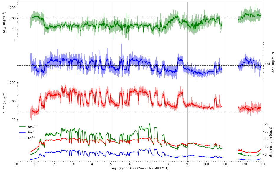
Step 12: Draw a depth scale along top of figure#
Draw an x-axis using an alternate scale (depth) along top of figure. First, explore how to plot the depth to correspond to the date axis using a lambda function.
supp_data_2.loc[supp_data_1['depth_mid (m)'] >= 1700, 'ageGICC05_mid (yr BP)']
2630      33490.0091
2631      33500.0082
2632      33509.9918
2633      33519.9707
2634      33529.9916
            ...
11441    128580.0400
11442    128590.0400
11443    128600.0814
11444    128608.8127
11445    128616.1926
Name: ageGICC05_mid (yr BP), Length: 8815, dtype: float64
supp_data_2.loc[supp_data_2['depth_mid (m)'] >= 1700, 'ageGICC05_mid (yr BP)'].min()
33490.0091
supp_data_2.loc[supp_data_2['depth_mid (m)'] >= 2400, 'age_kyr'].min()
123.3099824
neem_depth_labels = [1000, 1500, 1600, 1700, 1800, 1900, 2000, 2100, 2200, 2400]
supp_data_2.loc[supp_data_2['depth_mid (m)'] >= 1700, 'age_kyr'].min()
depth_to_kyr = lambda d: supp_data_2.loc[supp_data_1['depth_mid (m)'] >= d, 'age_kyr'].min()

ax_top_xticks = [depth_to_kyr(d) for d in neem_depth_labels]
ax_top_xticks
[7.1899559,
 15.4499691,
 23.48005,
 33.4900091,
 42.43005,
 53.0400041,
 70.6099891,
 86.52002499999999,
 107.96999240000001,
 123.3099824]
kyr_to_depth = lambda y: supp_data_2.loc[supp_data_2['age_kyr'] <= y, 'depth_mid (m)'].max()
print(kyr_to_depth(130))
2432.2073
Then, using the exploration above (repeated here as it will appear in the code):
ax_top = axes[0].twiny()
ax_top.set_xlabel('NEEM depth (m)')
ax_top.xaxis.set_label_position('top')
ax_top.tick_params(top=True)
neem_depth_labels = [1000, 1500, 1600, 1700, 1800, 1900, 2000, 2100,
                     2200, 2400]
supp_data_2.loc[supp_data_2['depth_mid (m)'] >= 1700, 'age_kyr'].min()
depth_to_kyr = lambda d: supp_data_2.loc[supp_data_2['depth_mid (m)'] >= d,
                                         'age_kyr'].min()
Draw an x-axis using an alternate scale (depth) along top of figure:
ax_top.set_xlim(0, 130)
ax_top_xticks = [depth_to_kyr(d) for d in neem_depth_labels]
ax_top.set_xticks(ax_top_xticks)
ax_top.set_xticklabels(neem_depth_labels, rotation=90)
ax_top.tick_params(direction='in')
# Figure 2
# Create a new figure with four subplots.
fig, axes = plt.subplots(4, 1, sharex=True, figsize=(15,10))
fig.subplots_adjust(hspace=0)

###########################################################################
# Draw an x-axis using an alternate scale (depth) along top of figure.
ax_top = axes[0].twiny()
ax_top.set_xlabel('NEEM depth (m)')
ax_top.xaxis.set_label_position('top')
ax_top.tick_params(top=True)
neem_depth_labels = [1000, 1500, 1600, 1700, 1800, 1900, 2000, 2100,
                     2200, 2400]
supp_data_2.loc[supp_data_2['depth_mid (m)'] >= 1700, 'age_kyr'].min()
depth_to_kyr = lambda d: supp_data_2.loc[supp_data_2['depth_mid (m)'] >= d,
                                         'age_kyr'].min()
ax_top.set_xlim(0, 130)
ax_top_xticks = [depth_to_kyr(d) for d in neem_depth_labels]
ax_top.set_xticks(ax_top_xticks)
ax_top.set_xticklabels(neem_depth_labels, rotation=90)
ax_top.tick_params(direction='in')
###########################################################################

# Draw all tick marks inside the plot area.
for i in range(4):
    axes[i].tick_params(which='both', direction='in')

# Use log scale for y-axis in subplots a-c, but don't use exponential format
# for y-axis labels.
for i in range(3):
    axes[i].set_yscale('log')
    axes[i].yaxis.set_major_formatter(ticker.ScalarFormatter())

# The 2nd and 4th plots have y-axis labels and tick marks on the right.
for i in [1, 3]:
    axes[i].yaxis.set_label_position('right')
    axes[i].tick_params(which='both', left=False, right=True,
                        labelleft=False, labelright=True)

# Remove lines that don't appear in Figure 2 as published in Nature.
for i in [1, 3]:
    axes[i].spines['left'].set_visible(False)
for i in [0, 1, 2]:
    axes[i].spines['bottom'].set_visible(False)
for i in [1, 2, 3]:
    axes[i].spines['top'].set_visible(False)

# Plot data using a lighter shade (by setting alpha=0.4).
supp_data_2.plot(ax=axes[0], x='age_kyr', y='NH4source (ng/m3)',
                 color='green', alpha=0.4, legend=False)
supp_data_2.plot(ax=axes[1], x='age_kyr', y='Nasource (ng/m3)',
                 color='blue', alpha=0.4, legend=False)
supp_data_2.plot(ax=axes[2], x='age_kyr', y='Casource (ng/m3)',
                 color='red', alpha=0.4, legend=False)

# Calculate and plot the smoothed function values using a darker line.
# Use min_periods to remove extraneous "mean" values when the actual data
# is "NaN".
supp_data_2_smoothed = supp_data_2.rolling(21, min_periods=21, center=True)
supp_data_2_rolling_mean = supp_data_2_smoothed.mean()

# Plot the 21 point running means of the 10 year data.
supp_data_2_rolling_mean.plot(ax=axes[0], x='age_kyr', y='NH4source (ng/m3)',
                              color='green', legend=False)
supp_data_2_rolling_mean.plot(ax=axes[1], x='age_kyr', y='Nasource (ng/m3)',
                              color='blue', legend=False)
supp_data_2_rolling_mean.plot(ax=axes[2], x='age_kyr', y='Casource (ng/m3)',
                              color='red', legend=False)

# Plot the dashed lines indicating the early Holocene average.
# Dates selected based on the title of Figure 3.
early_hol_data_2 = (
    supp_data_2[(supp_data_2.age_kyr >= 7.6) & (supp_data_2.age_kyr <= 9.8)]
               [['NH4source (ng/m3)', 'Nasource (ng/m3)', 'Casource (ng/m3)']])
early_hol_mean = early_hol_data_2.mean()
axes[0].axhline(y=early_hol_mean['NH4source (ng/m3)'],
                color='black', linestyle='--')
axes[1].axhline(y=early_hol_mean['Nasource (ng/m3)'],
                color='black', linestyle='--')
axes[2].axhline(y=early_hol_mean['Casource (ng/m3)'],
                color='black', linestyle='--')

# Subplot 2d.
supp_data_2.plot(ax=axes[3], x='age_kyr', y='NH4 atm. residence time (days)',
                 color='green', label='${NH_4}^+$')
supp_data_2.plot(ax=axes[3], x='age_kyr', y='Na atm. residence time (days)',
                 color='blue', label='$Na^+$')
supp_data_2.plot(ax=axes[3], x='age_kyr', y='Ca atm. residence time (days)',
                 color='red', label='$Ca^{2+}$')
axes[3].legend(loc='upper left', frameon=False)

# Draw vertical gridlines.
for i in range(4):
    axes[i].xaxis.grid(which='major')
for i in [0, 2]:
    axes[i].spines['right'].set_color('lightgrey')

# Set labels directly on the axes objects. Matplotlib supports a subset of latex.
# See https://matplotlib.org/stable/tutorials/text/mathtext.html for documentation.
axes[0].set_ylabel(r'$NH_4^+$ (ng $m^{-3}$)')
axes[1].set_ylabel(r'$Na^+$ (ng $m^{-3}$)', )
axes[2].set_ylabel(r'$Ca^{2+}$ (ng $m^{-3}$)')
axes[3].set_ylabel('atm. res. time (days)')

axes[3].set_xlabel('Age (kyr BP GICC05modelext-NEEM-1)')

# Set x-axis ticks (default ticks were drawn every 20 kyr).
NUM_XTICKS = 14
axes[3].set_xlim(0, 130)
axes[3].xaxis.set_major_locator(ticker.LinearLocator(NUM_XTICKS))
axes[3].xaxis.set_minor_locator(ticker.LinearLocator(10 * NUM_XTICKS - 1))

# Show x-axis tick marks only on the bottommost plot.
for i in range(3):
    axes[i].tick_params(axis='x', which='both', bottom=False)
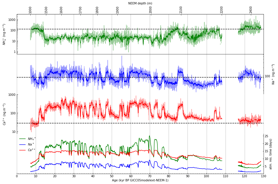
Step 13: Remove extraneous spines#
Remove the right and bottom spines created by the new x-axis by setting their visibility to False:
ax_top.spines['right'].set_visible(False)
ax_top.spines['bottom'].set_visible(False)
# Figure 2
# Create a new figure with four subplots.
fig, axes = plt.subplots(4, 1, sharex=True, figsize=(15,10))
fig.subplots_adjust(hspace=0)

# Draw an x-axis using an alternate scale (depth) along top of figure.
ax_top = axes[0].twiny()
ax_top.set_xlabel('NEEM depth (m)')
ax_top.xaxis.set_label_position('top')
ax_top.tick_params(top=True)
neem_depth_labels = [1000, 1500, 1600, 1700, 1800, 1900, 2000, 2100,
                     2200, 2400]
supp_data_2.loc[supp_data_2['depth_mid (m)'] >= 1700, 'age_kyr'].min()
depth_to_kyr = lambda d: supp_data_2.loc[supp_data_2['depth_mid (m)'] >= d,
                                         'age_kyr'].min()
ax_top.set_xlim(0, 130)
ax_top_xticks = [depth_to_kyr(d) for d in neem_depth_labels]
ax_top.set_xticks(ax_top_xticks)
ax_top.set_xticklabels(neem_depth_labels, rotation=90)
ax_top.tick_params(direction='in')

# Draw all tick marks inside the plot area.
for i in range(4):
    axes[i].tick_params(which='both', direction='in')

# Use log scale for y-axis in subplots a-c, but don't use exponential format
# for y-axis labels.
for i in range(3):
    axes[i].set_yscale('log')
    axes[i].yaxis.set_major_formatter(ticker.ScalarFormatter())

# The 2nd and 4th plots have y-axis labels and tick marks on the right.
for i in [1, 3]:
    axes[i].yaxis.set_label_position('right')
    axes[i].tick_params(which='both', left=False, right=True,
                        labelleft=False, labelright=True)

# Remove lines that don't appear in Figure 2 as published in Nature.
for i in [1, 3]:
    axes[i].spines['left'].set_visible(False)
for i in [0, 1, 2]:
    axes[i].spines['bottom'].set_visible(False)
for i in [1, 2, 3]:
    axes[i].spines['top'].set_visible(False)
###########################################################################
ax_top.spines['right'].set_visible(False)
ax_top.spines['bottom'].set_visible(False)
###########################################################################

# Plot data using a lighter shade (by setting alpha=0.4).
supp_data_2.plot(ax=axes[0], x='age_kyr', y='NH4source (ng/m3)',
                 color='green', alpha=0.4, legend=False)
supp_data_2.plot(ax=axes[1], x='age_kyr', y='Nasource (ng/m3)',
                 color='blue', alpha=0.4, legend=False)
supp_data_2.plot(ax=axes[2], x='age_kyr', y='Casource (ng/m3)',
                 color='red', alpha=0.4, legend=False)

# Calculate and plot the smoothed function values using a darker line.
# Use min_periods to remove extraneous "mean" values when the actual data
# is "NaN".
supp_data_2_smoothed = supp_data_2.rolling(21, min_periods=21, center=True)
supp_data_2_rolling_mean = supp_data_2_smoothed.mean()

# Plot the 21 point running means of the 10 year data.
supp_data_2_rolling_mean.plot(ax=axes[0], x='age_kyr', y='NH4source (ng/m3)',
                              color='green', legend=False)
supp_data_2_rolling_mean.plot(ax=axes[1], x='age_kyr', y='Nasource (ng/m3)',
                              color='blue', legend=False)
supp_data_2_rolling_mean.plot(ax=axes[2], x='age_kyr', y='Casource (ng/m3)',
                              color='red', legend=False)

# Plot the dashed lines indicating the early Holocene average.
# Dates selected based on the title of Figure 3.
early_hol_data_2 = (
    supp_data_2[(supp_data_2.age_kyr >= 7.6) & (supp_data_2.age_kyr <= 9.8)]
               [['NH4source (ng/m3)', 'Nasource (ng/m3)', 'Casource (ng/m3)']])
early_hol_mean = early_hol_data_2.mean()
axes[0].axhline(y=early_hol_mean['NH4source (ng/m3)'],
                color='black', linestyle='--')
axes[1].axhline(y=early_hol_mean['Nasource (ng/m3)'],
                color='black', linestyle='--')
axes[2].axhline(y=early_hol_mean['Casource (ng/m3)'],
                color='black', linestyle='--')

# Subplot 2d.
supp_data_2.plot(ax=axes[3], x='age_kyr', y='NH4 atm. residence time (days)',
                 color='green', label='${NH_4}^+$')
supp_data_2.plot(ax=axes[3], x='age_kyr', y='Na atm. residence time (days)',
                 color='blue', label='$Na^+$')
supp_data_2.plot(ax=axes[3], x='age_kyr', y='Ca atm. residence time (days)',
                 color='red', label='$Ca^{2+}$')
axes[3].legend(loc='upper left', frameon=False)

# Draw vertical gridlines.
for i in range(4):
    axes[i].xaxis.grid(which='major')
for i in [0, 2]:
    axes[i].spines['right'].set_color('lightgrey')

# Set labels directly on the axes objects. Matplotlib supports a subset of latex.
# See https://matplotlib.org/stable/tutorials/text/mathtext.html for documentation.
axes[0].set_ylabel(r'$NH_4^+$ (ng $m^{-3}$)')
axes[1].set_ylabel(r'$Na^+$ (ng $m^{-3}$)', )
axes[2].set_ylabel(r'$Ca^{2+}$ (ng $m^{-3}$)')
axes[3].set_ylabel('atm. res. time (days)')

axes[3].set_xlabel('Age (kyr BP GICC05modelext-NEEM-1)')

# Set x-axis ticks (default ticks were drawn every 20 kyr).
NUM_XTICKS = 14
axes[3].set_xlim(0, 130)
axes[3].xaxis.set_major_locator(ticker.LinearLocator(NUM_XTICKS))
axes[3].xaxis.set_minor_locator(ticker.LinearLocator(10 * NUM_XTICKS - 1))

# Show x-axis tick marks only on the bottommost plot.
for i in range(3):
    axes[i].tick_params(axis='x', which='both', bottom=False)
Step 14: Plot gray uncertainty bands#
In subplots 2a, 2b, and 2c, plot light gray uncertainty bands:
x = supp_data_2['age_kyr']
axes[0].fill_between(x, supp_data_2['NH4source+1sigma (ng/m3)'],
                     supp_data_2['NH4source-1sigma (ng/m3)'],
                     facecolor='lightgray')
axes[1].fill_between(x, supp_data_2['Nasource+1sigma (ng/m3)'],
                     supp_data_2['Nasource-1sigma (ng/m3)'],
                     facecolor='lightgray')
axes[2].fill_between(x, supp_data_2['Casource+1sigma (ng/m3)'],
                     supp_data_2['Casource-1sigma (ng/m3)'],
                     facecolor='lightgray')
# Figure 2
# Create a new figure with four subplots.
fig, axes = plt.subplots(4, 1, sharex=True, figsize=(15,10))
fig.subplots_adjust(hspace=0)

# Draw an x-axis using an alternate scale (depth) along top of figure.
ax_top = axes[0].twiny()
ax_top.set_xlabel('NEEM depth (m)')
ax_top.xaxis.set_label_position('top')
ax_top.tick_params(top=True)
neem_depth_labels = [1000, 1500, 1600, 1700, 1800, 1900, 2000, 2100,
                     2200, 2400]
supp_data_2.loc[supp_data_2['depth_mid (m)'] >= 1700, 'age_kyr'].min()
depth_to_kyr = lambda d: supp_data_2.loc[supp_data_2['depth_mid (m)'] >= d,
                                         'age_kyr'].min()
ax_top.set_xlim(0, 130)
ax_top_xticks = [depth_to_kyr(d) for d in neem_depth_labels]
ax_top.set_xticks(ax_top_xticks)
ax_top.set_xticklabels(neem_depth_labels, rotation=90)
ax_top.tick_params(direction='in')

# Draw all tick marks inside the plot area.
for i in range(4):
    axes[i].tick_params(which='both', direction='in')

# Use log scale for y-axis in subplots a-c, but don't use exponential format
# for y-axis labels.
for i in range(3):
    axes[i].set_yscale('log')
    axes[i].yaxis.set_major_formatter(ticker.ScalarFormatter())

# The 2nd and 4th plots have y-axis labels and tick marks on the right.
for i in [1, 3]:
    axes[i].yaxis.set_label_position('right')
    axes[i].tick_params(which='both', left=False, right=True,
                        labelleft=False, labelright=True)

# Remove lines that don't appear in Figure 2 as published in Nature.
for i in [1, 3]:
    axes[i].spines['left'].set_visible(False)
for i in [0, 1, 2]:
    axes[i].spines['bottom'].set_visible(False)
for i in [1, 2, 3]:
    axes[i].spines['top'].set_visible(False)
ax_top.spines['right'].set_visible(False)
ax_top.spines['bottom'].set_visible(False)

###############################################################################
# Subplots 2a, 2b, and 2c.
# Plot gray bands first.
x = supp_data_2['age_kyr']
axes[0].fill_between(x, supp_data_2['NH4source+1sigma (ng/m3)'],
                     supp_data_2['NH4source-1sigma (ng/m3)'],
                     facecolor='lightgray')
axes[1].fill_between(x, supp_data_2['Nasource+1sigma (ng/m3)'],
                     supp_data_2['Nasource-1sigma (ng/m3)'],
                     facecolor='lightgray')
axes[2].fill_between(x, supp_data_2['Casource+1sigma (ng/m3)'],
                     supp_data_2['Casource-1sigma (ng/m3)'],
                     facecolor='lightgray')
###############################################################################

# Plot data using a lighter shade (by setting alpha=0.4).
supp_data_2.plot(ax=axes[0], x='age_kyr', y='NH4source (ng/m3)',
                 color='green', alpha=0.4, legend=False)
supp_data_2.plot(ax=axes[1], x='age_kyr', y='Nasource (ng/m3)',
                 color='blue', alpha=0.4, legend=False)
supp_data_2.plot(ax=axes[2], x='age_kyr', y='Casource (ng/m3)',
                 color='red', alpha=0.4, legend=False)

# Calculate and plot the smoothed function values using a darker line.
# Use min_periods to remove extraneous "mean" values when the actual data
# is "NaN".
supp_data_2_smoothed = supp_data_2.rolling(21, min_periods=21, center=True)
supp_data_2_rolling_mean = supp_data_2_smoothed.mean()

# Plot the 21 point running means of the 10 year data.
supp_data_2_rolling_mean.plot(ax=axes[0], x='age_kyr', y='NH4source (ng/m3)',
                              color='green', legend=False)
supp_data_2_rolling_mean.plot(ax=axes[1], x='age_kyr', y='Nasource (ng/m3)',
                              color='blue', legend=False)
supp_data_2_rolling_mean.plot(ax=axes[2], x='age_kyr', y='Casource (ng/m3)',
                              color='red', legend=False)

# Plot the dashed lines indicating the early Holocene average.
# Dates selected based on the title of Figure 3.
early_hol_data_2 = (
    supp_data_2[(supp_data_2.age_kyr >= 7.6) & (supp_data_2.age_kyr <= 9.8)]
               [['NH4source (ng/m3)', 'Nasource (ng/m3)', 'Casource (ng/m3)']])
early_hol_mean = early_hol_data_2.mean()
axes[0].axhline(y=early_hol_mean['NH4source (ng/m3)'],
                color='black', linestyle='--')
axes[1].axhline(y=early_hol_mean['Nasource (ng/m3)'],
                color='black', linestyle='--')
axes[2].axhline(y=early_hol_mean['Casource (ng/m3)'],
                color='black', linestyle='--')

# Subplot 2d.
supp_data_2.plot(ax=axes[3], x='age_kyr', y='NH4 atm. residence time (days)',
                 color='green', label='${NH_4}^+$')
supp_data_2.plot(ax=axes[3], x='age_kyr', y='Na atm. residence time (days)',
                 color='blue', label='$Na^+$')
supp_data_2.plot(ax=axes[3], x='age_kyr', y='Ca atm. residence time (days)',
                 color='red', label='$Ca^{2+}$')
axes[3].legend(loc='upper left', frameon=False)

# Draw vertical gridlines.
for i in range(4):
    axes[i].xaxis.grid(which='major')
for i in [0, 2]:
    axes[i].spines['right'].set_color('lightgrey')

# Set labels directly on the axes objects. Matplotlib supports a subset of latex.
# See https://matplotlib.org/stable/tutorials/text/mathtext.html for documentation.
axes[0].set_ylabel(r'$NH_4^+$ (ng $m^{-3}$)')
axes[1].set_ylabel(r'$Na^+$ (ng $m^{-3}$)', )
axes[2].set_ylabel(r'$Ca^{2+}$ (ng $m^{-3}$)')
axes[3].set_ylabel('atm. res. time (days)')

axes[3].set_xlabel('Age (kyr BP GICC05modelext-NEEM-1)')

# Set x-axis ticks (default ticks were drawn every 20 kyr).
NUM_XTICKS = 14
axes[3].set_xlim(0, 130)
axes[3].xaxis.set_major_locator(ticker.LinearLocator(NUM_XTICKS))
axes[3].xaxis.set_minor_locator(ticker.LinearLocator(10 * NUM_XTICKS - 1))

# Show x-axis tick marks only on the bottommost plot.
for i in range(3):
    axes[i].tick_params(axis='x', which='both', bottom=False)
Step 15: Tweak the y-axis settings#
Tweak the y-axis settings to correspond to the published figure:
axes[0].set_ylim(1, 3000)
axes[1].set_ylim(10, 1000)
axes[2].set_ylim(10, 10000)
axes[3].set_ylim(0, 25)
# Figure 2
# Create a new figure with four subplots.
fig, axes = plt.subplots(4, 1, sharex=True, figsize=(15,10))
fig.subplots_adjust(hspace=0)

# Draw an x-axis using an alternate scale (depth) along top of figure.
ax_top = axes[0].twiny()
ax_top.set_xlabel('NEEM depth (m)')
ax_top.xaxis.set_label_position('top')
ax_top.tick_params(top=True)
neem_depth_labels = [1000, 1500, 1600, 1700, 1800, 1900, 2000, 2100,
                     2200, 2400]
supp_data_2.loc[supp_data_2['depth_mid (m)'] >= 1700, 'age_kyr'].min()
depth_to_kyr = lambda d: supp_data_2.loc[supp_data_2['depth_mid (m)'] >= d,
                                         'age_kyr'].min()
ax_top.set_xlim(0, 130)
ax_top_xticks = [depth_to_kyr(d) for d in neem_depth_labels]
ax_top.set_xticks(ax_top_xticks)
ax_top.set_xticklabels(neem_depth_labels, rotation=90)
ax_top.tick_params(direction='in')

# Draw all tick marks inside the plot area.
for i in range(4):
    axes[i].tick_params(which='both', direction='in')

# Use log scale for y-axis in subplots a-c, but don't use exponential format
# for y-axis labels.
for i in range(3):
    axes[i].set_yscale('log')
    axes[i].yaxis.set_major_formatter(ticker.ScalarFormatter())

# The 2nd and 4th plots have y-axis labels and tick marks on the right.
for i in [1, 3]:
    axes[i].yaxis.set_label_position('right')
    axes[i].tick_params(which='both', left=False, right=True,
                        labelleft=False, labelright=True)

# Remove lines that don't appear in Figure 2 as published in Nature.
for i in [1, 3]:
    axes[i].spines['left'].set_visible(False)
for i in [0, 1, 2]:
    axes[i].spines['bottom'].set_visible(False)
for i in [1, 2, 3]:
    axes[i].spines['top'].set_visible(False)
ax_top.spines['right'].set_visible(False)
ax_top.spines['bottom'].set_visible(False)

# Subplots 2a, 2b, and 2c.
# Plot gray bands first.
x = supp_data_2['age_kyr']
axes[0].fill_between(x, supp_data_2['NH4source+1sigma (ng/m3)'],
                     supp_data_2['NH4source-1sigma (ng/m3)'],
                     facecolor='lightgray')
axes[1].fill_between(x, supp_data_2['Nasource+1sigma (ng/m3)'],
                     supp_data_2['Nasource-1sigma (ng/m3)'],
                     facecolor='lightgray')
axes[2].fill_between(x, supp_data_2['Casource+1sigma (ng/m3)'],
                     supp_data_2['Casource-1sigma (ng/m3)'],
                     facecolor='lightgray')

# Plot data using a lighter shade (by setting alpha=0.4).
supp_data_2.plot(ax=axes[0], x='age_kyr', y='NH4source (ng/m3)',
                 color='green', alpha=0.4, legend=False)
supp_data_2.plot(ax=axes[1], x='age_kyr', y='Nasource (ng/m3)',
                 color='blue', alpha=0.4, legend=False)
supp_data_2.plot(ax=axes[2], x='age_kyr', y='Casource (ng/m3)',
                 color='red', alpha=0.4, legend=False)

# Calculate and plot the smoothed function values using a darker line.
# Use min_periods to remove extraneous "mean" values when the actual data
# is "NaN".
supp_data_2_smoothed = supp_data_2.rolling(21, min_periods=21, center=True)
supp_data_2_rolling_mean = supp_data_2_smoothed.mean()

# Plot the 21 point running means of the 10 year data.
supp_data_2_rolling_mean.plot(ax=axes[0], x='age_kyr', y='NH4source (ng/m3)',
                              color='green', legend=False)
supp_data_2_rolling_mean.plot(ax=axes[1], x='age_kyr', y='Nasource (ng/m3)',
                              color='blue', legend=False)
supp_data_2_rolling_mean.plot(ax=axes[2], x='age_kyr', y='Casource (ng/m3)',
                              color='red', legend=False)

# Plot the dashed lines indicating the early Holocene average.
# Dates selected based on the title of Figure 3.
early_hol_data_2 = (
    supp_data_2[(supp_data_2.age_kyr >= 7.6) & (supp_data_2.age_kyr <= 9.8)]
               [['NH4source (ng/m3)', 'Nasource (ng/m3)', 'Casource (ng/m3)']])
early_hol_mean = early_hol_data_2.mean()
axes[0].axhline(y=early_hol_mean['NH4source (ng/m3)'],
                color='black', linestyle='--')
axes[1].axhline(y=early_hol_mean['Nasource (ng/m3)'],
                color='black', linestyle='--')
axes[2].axhline(y=early_hol_mean['Casource (ng/m3)'],
                color='black', linestyle='--')

# Subplot 2d.
supp_data_2.plot(ax=axes[3], x='age_kyr', y='NH4 atm. residence time (days)',
                 color='green', label='${NH_4}^+$')
supp_data_2.plot(ax=axes[3], x='age_kyr', y='Na atm. residence time (days)',
                 color='blue', label='$Na^+$')
supp_data_2.plot(ax=axes[3], x='age_kyr', y='Ca atm. residence time (days)',
                 color='red', label='$Ca^{2+}$')
axes[3].legend(loc='upper left', frameon=False)

# Draw vertical gridlines.
for i in range(4):
    axes[i].xaxis.grid(which='major')
for i in [0, 2]:
    axes[i].spines['right'].set_color('lightgrey')

# Set labels directly on the axes objects. Matplotlib supports a subset of latex.
# See https://matplotlib.org/stable/tutorials/text/mathtext.html for documentation.
axes[0].set_ylabel(r'$NH_4^+$ (ng $m^{-3}$)')
axes[1].set_ylabel(r'$Na^+$ (ng $m^{-3}$)', )
axes[2].set_ylabel(r'$Ca^{2+}$ (ng $m^{-3}$)')
axes[3].set_ylabel('atm. res. time (days)')

axes[3].set_xlabel('Age (kyr BP GICC05modelext-NEEM-1)')

# Set x-axis ticks (default ticks were drawn every 20 kyr).
NUM_XTICKS = 14
axes[3].set_xlim(0, 130)
axes[3].xaxis.set_major_locator(ticker.LinearLocator(NUM_XTICKS))
axes[3].xaxis.set_minor_locator(ticker.LinearLocator(10 * NUM_XTICKS - 1))

# Show x-axis tick marks only on the bottommost plot.
for i in range(3):
    axes[i].tick_params(axis='x', which='both', bottom=False)

###############################################################################
# Tweak y-axis settings to correspond to published figure.
axes[0].set_ylim(1, 3000)
axes[1].set_ylim(10, 1000)
axes[2].set_ylim(10, 10000)
axes[3].set_ylim(0, 25)
###############################################################################
(0, 25)
Step 16: Annotate the figure#
In this step, we annotate the figure. First, add ‘a’, ‘b’, ‘c’, and ‘d’ to the subplots using the code:
axes[0].annotate('a', xy=(0.05, 0.85), xycoords='axes fraction',
                 fontsize=20, fontweight='bold')
axes[1].annotate('b', xy=(0.95, 0.85), xycoords='axes fraction',
                 fontsize=20, fontweight='bold')
axes[2].annotate('c', xy=(0.05, 0.85), xycoords='axes fraction',
                 fontsize=20, fontweight='bold')
axes[3].annotate('d', xy=(0.95, 0.85), xycoords='axes fraction',
                 fontsize=20, fontweight='bold')
Then, add the notations ‘Hol’, ‘LGM’, ‘Warm interstadials’, ‘Cold interstadials’, and ‘Eem’ to subplot c:
axes[2].annotate('Hol', xy=(5, 80), xycoords='data', fontsize=16)
axes[2].annotate('LGM', xy=(20, 1000), xycoords='data', fontsize=16)
axes[2].annotate('Cold stadials', xy=(34, 1000), xycoords='data', fontsize=16)
axes[2].annotate('Warm interstadials', xy=(29, 12), xycoords='data', fontsize=16)
axes[2].annotate('Eem', xy=(120, 80), xycoords='data', fontsize=16)
# Figure 2
# Create a new figure with four subplots.
fig, axes = plt.subplots(4, 1, sharex=True, figsize=(15,10))
fig.subplots_adjust(hspace=0)

# Draw an x-axis using an alternate scale (depth) along top of figure.
ax_top = axes[0].twiny()
ax_top.set_xlabel('NEEM depth (m)')
ax_top.xaxis.set_label_position('top')
ax_top.tick_params(top=True)
neem_depth_labels = [1000, 1500, 1600, 1700, 1800, 1900, 2000, 2100,
                     2200, 2400]
supp_data_2.loc[supp_data_2['depth_mid (m)'] >= 1700, 'age_kyr'].min()
depth_to_kyr = lambda d: supp_data_2.loc[supp_data_2['depth_mid (m)'] >= d,
                                         'age_kyr'].min()
ax_top.set_xlim(0, 130)
ax_top_xticks = [depth_to_kyr(d) for d in neem_depth_labels]
ax_top.set_xticks(ax_top_xticks)
ax_top.set_xticklabels(neem_depth_labels, rotation=90)
ax_top.tick_params(direction='in')

# Draw all tick marks inside the plot area.
for i in range(4):
    axes[i].tick_params(which='both', direction='in')

# Use log scale for y-axis in subplots a-c, but don't use exponential format
# for y-axis labels.
for i in range(3):
    axes[i].set_yscale('log')
    axes[i].yaxis.set_major_formatter(ticker.ScalarFormatter())

# The 2nd and 4th plots have y-axis labels and tick marks on the right.
for i in [1, 3]:
    axes[i].yaxis.set_label_position('right')
    axes[i].tick_params(which='both', left=False, right=True,
                        labelleft=False, labelright=True)

# Remove lines that don't appear in Figure 2 as published in Nature.
for i in [1, 3]:
    axes[i].spines['left'].set_visible(False)
for i in [0, 1, 2]:
    axes[i].spines['bottom'].set_visible(False)
for i in [1, 2, 3]:
    axes[i].spines['top'].set_visible(False)
ax_top.spines['right'].set_visible(False)
ax_top.spines['bottom'].set_visible(False)

# Subplots 2a, 2b, and 2c.
# Plot gray bands first.
x = supp_data_2['age_kyr']
axes[0].fill_between(x, supp_data_2['NH4source+1sigma (ng/m3)'],
                     supp_data_2['NH4source-1sigma (ng/m3)'],
                     facecolor='lightgray')
axes[1].fill_between(x, supp_data_2['Nasource+1sigma (ng/m3)'],
                     supp_data_2['Nasource-1sigma (ng/m3)'],
                     facecolor='lightgray')
axes[2].fill_between(x, supp_data_2['Casource+1sigma (ng/m3)'],
                     supp_data_2['Casource-1sigma (ng/m3)'],
                     facecolor='lightgray')

# Plot data using a lighter shade (by setting alpha=0.4).
supp_data_2.plot(ax=axes[0], x='age_kyr', y='NH4source (ng/m3)',
                 color='green', alpha=0.4, legend=False)
supp_data_2.plot(ax=axes[1], x='age_kyr', y='Nasource (ng/m3)',
                 color='blue', alpha=0.4, legend=False)
supp_data_2.plot(ax=axes[2], x='age_kyr', y='Casource (ng/m3)',
                 color='red', alpha=0.4, legend=False)

# Calculate and plot the smoothed function values using a darker line.
# Use min_periods to remove extraneous "mean" values when the actual data
# is "NaN".
supp_data_2_smoothed = supp_data_2.rolling(21, min_periods=21, center=True)
supp_data_2_rolling_mean = supp_data_2_smoothed.mean()

# Plot the 21 point running means of the 10 year data.
supp_data_2_rolling_mean.plot(ax=axes[0], x='age_kyr', y='NH4source (ng/m3)',
                              color='green', legend=False)
supp_data_2_rolling_mean.plot(ax=axes[1], x='age_kyr', y='Nasource (ng/m3)',
                              color='blue', legend=False)
supp_data_2_rolling_mean.plot(ax=axes[2], x='age_kyr', y='Casource (ng/m3)',
                              color='red', legend=False)

# Plot the dashed lines indicating the early Holocene average.
# Dates selected based on the title of Figure 3.
early_hol_data_2 = (
    supp_data_2[(supp_data_2.age_kyr >= 7.6) & (supp_data_2.age_kyr <= 9.8)]
               [['NH4source (ng/m3)', 'Nasource (ng/m3)', 'Casource (ng/m3)']])
early_hol_mean = early_hol_data_2.mean()
axes[0].axhline(y=early_hol_mean['NH4source (ng/m3)'],
                color='black', linestyle='--')
axes[1].axhline(y=early_hol_mean['Nasource (ng/m3)'],
                color='black', linestyle='--')
axes[2].axhline(y=early_hol_mean['Casource (ng/m3)'],
                color='black', linestyle='--')

# Subplot 2d.
supp_data_2.plot(ax=axes[3], x='age_kyr', y='NH4 atm. residence time (days)',
                 color='green', label='${NH_4}^+$')
supp_data_2.plot(ax=axes[3], x='age_kyr', y='Na atm. residence time (days)',
                 color='blue', label='$Na^+$')
supp_data_2.plot(ax=axes[3], x='age_kyr', y='Ca atm. residence time (days)',
                 color='red', label='$Ca^{2+}$')
axes[3].legend(loc='upper left', frameon=False)

# Draw vertical gridlines.
for i in range(4):
    axes[i].xaxis.grid(which='major')
for i in [0, 2]:
    axes[i].spines['right'].set_color('lightgrey')

# Set labels directly on the axes objects. Matplotlib supports a subset of latex.
# See https://matplotlib.org/stable/tutorials/text/mathtext.html for documentation.
axes[0].set_ylabel(r'$NH_4^+$ (ng $m^{-3}$)')
axes[1].set_ylabel(r'$Na^+$ (ng $m^{-3}$)', )
axes[2].set_ylabel(r'$Ca^{2+}$ (ng $m^{-3}$)')
axes[3].set_ylabel('atm. res. time (days)')

axes[3].set_xlabel('Age (kyr BP GICC05modelext-NEEM-1)')

# Set x-axis ticks (default ticks were drawn every 20 kyr).
NUM_XTICKS = 14
axes[3].set_xlim(0, 130)
axes[3].xaxis.set_major_locator(ticker.LinearLocator(NUM_XTICKS))
axes[3].xaxis.set_minor_locator(ticker.LinearLocator(10 * NUM_XTICKS - 1))

# Show x-axis tick marks only on the bottommost plot.
for i in range(3):
    axes[i].tick_params(axis='x', which='both', bottom=False)

# Tweak y-axis settings to correspond to published figure.
axes[0].set_ylim(1, 3000)
axes[1].set_ylim(10, 1000)
axes[2].set_ylim(10, 10000)
axes[3].set_ylim(0, 25)

###############################################################################
# Annotate the figure.
axes[0].annotate('a', xy=(0.05, 0.85), xycoords='axes fraction',
                 fontsize=20, fontweight='bold')
axes[1].annotate('b', xy=(0.95, 0.85), xycoords='axes fraction',
                 fontsize=20, fontweight='bold')
axes[2].annotate('c', xy=(0.05, 0.85), xycoords='axes fraction',
                 fontsize=20, fontweight='bold')
axes[3].annotate('d', xy=(0.95, 0.85), xycoords='axes fraction',
                 fontsize=20, fontweight='bold')

axes[2].annotate('Hol', xy=(5, 80), xycoords='data', fontsize=16)
axes[2].annotate('LGM', xy=(20, 1000), xycoords='data', fontsize=16)
axes[2].annotate('Cold stadials', xy=(34, 1000), xycoords='data', fontsize=16)
axes[2].annotate('Warm interstadials', xy=(29, 12), xycoords='data', fontsize=16)
axes[2].annotate('Eem', xy=(120, 80), xycoords='data', fontsize=16)
###############################################################################
Text(120, 80, 'Eem')
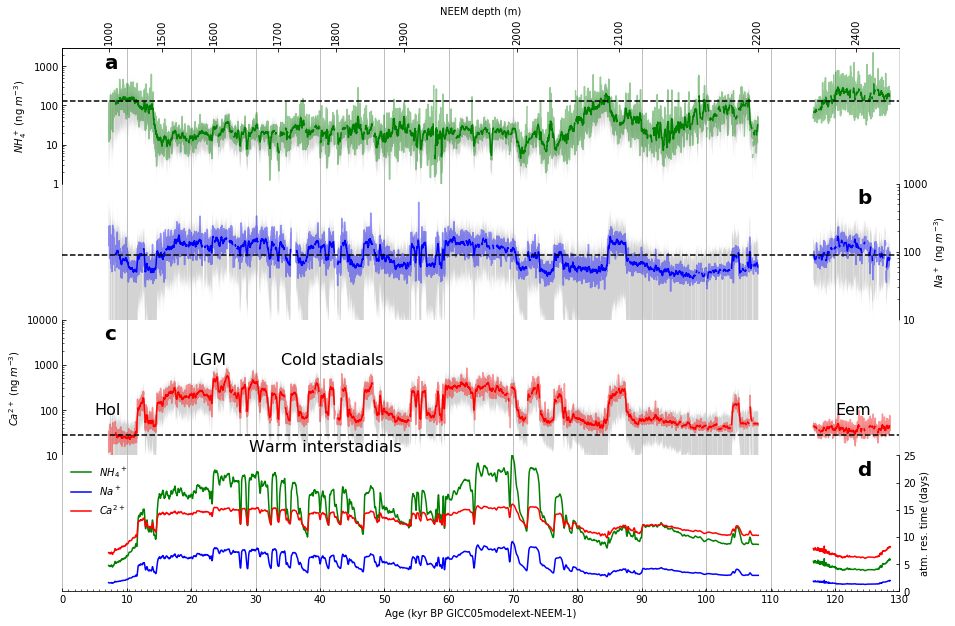
Step 17. Adjust the figure size and the font size of the labels on the x-axes, y-axes, and legend#
The figure size and the default font size, including all labels of all of the axes and in the legend, can be adjusted by the two lines:
fig, axes = plt.subplots(4, 1, sharex=True, figsize=(16,14))
plt.rcParams['font.size'] = 18
Note that when adjusting the font size, Matplotlib may alter the number of tick marks displayed. For example, in the preceding line, setting the default font size to 20 (instead of 18) causes many of the desired tick marks on the y-axes to disappear.
The default label size can be overridden. Here, the labels in the legend are adjusted in order to create a better fit in the upper left corner of subplot d:
axes[3].legend(loc='upper left', frameon=False, fontsize=14)
# Figure 2

# Create a new figure with four subplots.
###############################################################################
# Adjust the figure size and the default font size for the figure, which
# includes the labels on all of the x-axes, y-axes, and the legend.
fig, axes = plt.subplots(4, 1, sharex=True, figsize=(16,14))
plt.rcParams['font.size'] = 18
###############################################################################
fig.subplots_adjust(hspace=0)

# Draw an x-axis using an alternate scale (depth) along top of figure.
ax_top = axes[0].twiny()
ax_top.set_xlabel('NEEM depth (m)')
ax_top.xaxis.set_label_position('top')
ax_top.tick_params(top=True)
neem_depth_labels = [1000, 1500, 1600, 1700, 1800, 1900, 2000, 2100,
                     2200, 2400]
supp_data_2.loc[supp_data_2['depth_mid (m)'] >= 1700, 'age_kyr'].min()
depth_to_kyr = lambda d: supp_data_2.loc[supp_data_2['depth_mid (m)'] >= d,
                                         'age_kyr'].min()
ax_top.set_xlim(0, 130)
ax_top_xticks = [depth_to_kyr(d) for d in neem_depth_labels]
ax_top.set_xticks(ax_top_xticks)
ax_top.set_xticklabels(neem_depth_labels, rotation=90)
ax_top.tick_params(direction='in')

# Draw all tick marks inside the plot area.
for i in range(4):
    axes[i].tick_params(which='both', direction='in')

# Use log scale for y-axis in subplots a-c, but don't use exponential format
# for y-axis labels.
for i in range(3):
    axes[i].set_yscale('log')
    axes[i].yaxis.set_major_formatter(ticker.ScalarFormatter())

# The 2nd and 4th plots have y-axis labels and tick marks on the right.
for i in [1, 3]:
    axes[i].yaxis.set_label_position('right')
    axes[i].tick_params(which='both', left=False, right=True,
                        labelleft=False, labelright=True)

# Remove lines that don't appear in Figure 2 as published in Nature.
for i in [1, 3]:
    axes[i].spines['left'].set_visible(False)
for i in [0, 1, 2]:
    axes[i].spines['bottom'].set_visible(False)
for i in [1, 2, 3]:
    axes[i].spines['top'].set_visible(False)
ax_top.spines['right'].set_visible(False)
ax_top.spines['bottom'].set_visible(False)

# Subplots 2a, 2b, and 2c.
# Plot gray bands first.
x = supp_data_2['age_kyr']
axes[0].fill_between(x, supp_data_2['NH4source+1sigma (ng/m3)'],
                     supp_data_2['NH4source-1sigma (ng/m3)'],
                     facecolor='lightgray')
axes[1].fill_between(x, supp_data_2['Nasource+1sigma (ng/m3)'],
                     supp_data_2['Nasource-1sigma (ng/m3)'],
                     facecolor='lightgray')
axes[2].fill_between(x, supp_data_2['Casource+1sigma (ng/m3)'],
                     supp_data_2['Casource-1sigma (ng/m3)'],
                     facecolor='lightgray')

# Plot data using a lighter shade (by setting alpha=0.4).
supp_data_2.plot(ax=axes[0], x='age_kyr', y='NH4source (ng/m3)',
                 color='green', alpha=0.4, legend=False)
supp_data_2.plot(ax=axes[1], x='age_kyr', y='Nasource (ng/m3)',
                 color='blue', alpha=0.4, legend=False)
supp_data_2.plot(ax=axes[2], x='age_kyr', y='Casource (ng/m3)',
                 color='red', alpha=0.4, legend=False)

# Calculate and plot the smoothed function values using a darker line.
# Use min_periods to remove extraneous "mean" values when the actual data
# is "NaN".
supp_data_2_smoothed = supp_data_2.rolling(21, min_periods=21, center=True)
supp_data_2_rolling_mean = supp_data_2_smoothed.mean()

# Plot the 21 point running means of the 10 year data.
supp_data_2_rolling_mean.plot(ax=axes[0], x='age_kyr', y='NH4source (ng/m3)',
                              color='green', legend=False)
supp_data_2_rolling_mean.plot(ax=axes[1], x='age_kyr', y='Nasource (ng/m3)',
                              color='blue', legend=False)
supp_data_2_rolling_mean.plot(ax=axes[2], x='age_kyr', y='Casource (ng/m3)',
                              color='red', legend=False)

# Plot the dashed lines indicating the early Holocene average.
# Dates selected based on the title of Figure 3.
early_hol_data_2 = (
    supp_data_2[(supp_data_2.age_kyr >= 7.6) & (supp_data_2.age_kyr <= 9.8)]
               [['NH4source (ng/m3)', 'Nasource (ng/m3)', 'Casource (ng/m3)']])
early_hol_mean = early_hol_data_2.mean()
axes[0].axhline(y=early_hol_mean['NH4source (ng/m3)'],
                color='black', linestyle='--')
axes[1].axhline(y=early_hol_mean['Nasource (ng/m3)'],
                color='black', linestyle='--')
axes[2].axhline(y=early_hol_mean['Casource (ng/m3)'],
                color='black', linestyle='--')

# Subplot 2d.
supp_data_2.plot(ax=axes[3], x='age_kyr', y='NH4 atm. residence time (days)',
                 color='green', label='${NH_4}^+$')
supp_data_2.plot(ax=axes[3], x='age_kyr', y='Na atm. residence time (days)',
                 color='blue', label='$Na^+$')
supp_data_2.plot(ax=axes[3], x='age_kyr', y='Ca atm. residence time (days)',
                 color='red', label='$Ca^{2+}$')

###############################################################################
# Subplot 2d legend. The default label size is overridden in order to create
# a better fit in the upper left corner of subplot d.
axes[3].legend(loc='upper left', frameon=False, fontsize=14)
###############################################################################

# Draw vertical gridlines.
for i in range(4):
    axes[i].xaxis.grid(which='major')
for i in [0, 2]:
    axes[i].spines['right'].set_color('lightgrey')

# Set labels directly on the axes objects. Matplotlib supports a subset of latex.
# See https://matplotlib.org/stable/tutorials/text/mathtext.html for documentation.
axes[0].set_ylabel(r'$NH_4^+$ (ng $m^{-3}$)')
axes[1].set_ylabel(r'$Na^+$ (ng $m^{-3}$)', )
axes[2].set_ylabel(r'$Ca^{2+}$ (ng $m^{-3}$)')
axes[3].set_ylabel('atm. res. time (days)')

axes[3].set_xlabel('Age (kyr BP GICC05modelext-NEEM-1)')

# Set x-axis ticks (default ticks were drawn every 20 kyr).
NUM_XTICKS = 14
axes[3].set_xlim(0, 130)
axes[3].xaxis.set_major_locator(ticker.LinearLocator(NUM_XTICKS))
axes[3].xaxis.set_minor_locator(ticker.LinearLocator(10 * NUM_XTICKS - 1))

# Show x-axis tick marks only on the bottommost plot.
for i in range(3):
    axes[i].tick_params(axis='x', which='both', bottom=False)

# Tweak y-axis settings to correspond to published figure.
axes[0].set_ylim(1, 3000)
axes[1].set_ylim(10, 1000)
axes[2].set_ylim(10, 10000)
axes[3].set_ylim(0, 25)

# Annotate the figure.
axes[0].annotate('a', xy=(0.05, 0.85), xycoords='axes fraction',
                 fontsize=20, fontweight='bold')
axes[1].annotate('b', xy=(0.95, 0.85), xycoords='axes fraction',
                 fontsize=20, fontweight='bold')
axes[2].annotate('c', xy=(0.05, 0.85), xycoords='axes fraction',
                 fontsize=20, fontweight='bold')
axes[3].annotate('d', xy=(0.95, 0.85), xycoords='axes fraction',
                 fontsize=20, fontweight='bold')

axes[2].annotate('Hol', xy=(5, 80), xycoords='data', fontsize=16)
axes[2].annotate('LGM', xy=(20, 1000), xycoords='data', fontsize=16)
axes[2].annotate('Cold stadials', xy=(34, 1000), xycoords='data', fontsize=16)
axes[2].annotate('Warm interstadials', xy=(29, 12), xycoords='data', fontsize=16)
axes[2].annotate('Eem', xy=(120, 80), xycoords='data', fontsize=16)
Text(120, 80, 'Eem')
Step 18. Save the figure to a file#
And finally, we save the resulting figure to a file. The file formats available are backend-dependent. On one of the author’s systems, the available file formats were:
{'ps':   'Postscript',
 'eps':  'Encapsulated Postscript',
 'pdf':  'Portable Document Format',
 'pgf':  'PGF code for LaTeX',
 'png':  'Portable Network Graphics',
 'raw':  'Raw RGBA bitmap',
 'rgba': 'Raw RGBA bitmap',
 'svg':  'Scalable Vector Graphics',
 'svgz': 'Scalable Vector Graphics'}
To see a list of the file formats available on your system, execute the following cell.
plt.gcf().canvas.get_supported_filetypes()
{'ps': 'Postscript',
 'eps': 'Encapsulated Postscript',
 'pdf': 'Portable Document Format',
 'pgf': 'PGF code for LaTeX',
 'png': 'Portable Network Graphics',
 'raw': 'Raw RGBA bitmap',
 'rgba': 'Raw RGBA bitmap',
 'svg': 'Scalable Vector Graphics',
 'svgz': 'Scalable Vector Graphics'}
<Figure size 432x288 with 0 Axes>
The file format to be used is specified by the extension on the filename
given as the fname parameter to savefig. Here, we request png format and
also trim the blank space from the margins:
fig.savefig(fname='OurFig2.png', bbox_inches='tight', pad_inches=0)
Numerous options for savefig are available, including one to set the desired
resolution in dots per inch (dpi). For a full list of available options, see
the Matplotlib documentation:
https://matplotlib.org/stable/api/_as_gen/matplotlib.pyplot.savefig.html
# Figure 2

# Create a new figure with four subplots.
# Adjust the figure size and the default font size for the figure, which
# includes the labels on all of the x-axes, y-axes, and the legend.
fig, axes = plt.subplots(4, 1, sharex=True, figsize=(16,14))
plt.rcParams['font.size'] = 18
fig.subplots_adjust(hspace=0)

# Draw an x-axis using an alternate scale (depth) along top of figure.
ax_top = axes[0].twiny()
ax_top.set_xlabel('NEEM depth (m)')
ax_top.xaxis.set_label_position('top')
ax_top.tick_params(top=True)
neem_depth_labels = [1000, 1500, 1600, 1700, 1800, 1900, 2000, 2100,
                     2200, 2400]
supp_data_2.loc[supp_data_2['depth_mid (m)'] >= 1700, 'age_kyr'].min()
depth_to_kyr = lambda d: supp_data_2.loc[supp_data_2['depth_mid (m)'] >= d,
                                         'age_kyr'].min()
ax_top.set_xlim(0, 130)
ax_top_xticks = [depth_to_kyr(d) for d in neem_depth_labels]
ax_top.set_xticks(ax_top_xticks)
ax_top.set_xticklabels(neem_depth_labels, rotation=90)
ax_top.tick_params(direction='in')

# Draw all tick marks inside the plot area.
for i in range(4):
    axes[i].tick_params(which='both', direction='in')

# Use log scale for y-axis in subplots a-c, but don't use exponential format
# for y-axis labels.
for i in range(3):
    axes[i].set_yscale('log')
    axes[i].yaxis.set_major_formatter(ticker.ScalarFormatter())

# The 2nd and 4th plots have y-axis labels and tick marks on the right.
for i in [1, 3]:
    axes[i].yaxis.set_label_position('right')
    axes[i].tick_params(which='both', left=False, right=True,
                        labelleft=False, labelright=True)

# Remove lines that don't appear in Figure 2 as published in Nature.
for i in [1, 3]:
    axes[i].spines['left'].set_visible(False)
for i in [0, 1, 2]:
    axes[i].spines['bottom'].set_visible(False)
for i in [1, 2, 3]:
    axes[i].spines['top'].set_visible(False)
ax_top.spines['right'].set_visible(False)
ax_top.spines['bottom'].set_visible(False)

# Subplots 2a, 2b, and 2c.
# Plot gray bands first.
x = supp_data_2['age_kyr']
axes[0].fill_between(x, supp_data_2['NH4source+1sigma (ng/m3)'],
                     supp_data_2['NH4source-1sigma (ng/m3)'],
                     facecolor='lightgray')
axes[1].fill_between(x, supp_data_2['Nasource+1sigma (ng/m3)'],
                     supp_data_2['Nasource-1sigma (ng/m3)'],
                     facecolor='lightgray')
axes[2].fill_between(x, supp_data_2['Casource+1sigma (ng/m3)'],
                     supp_data_2['Casource-1sigma (ng/m3)'],
                     facecolor='lightgray')

# Plot data using a lighter shade (by setting alpha=0.4).
supp_data_2.plot(ax=axes[0], x='age_kyr', y='NH4source (ng/m3)',
                 color='green', alpha=0.4, legend=False)
supp_data_2.plot(ax=axes[1], x='age_kyr', y='Nasource (ng/m3)',
                 color='blue', alpha=0.4, legend=False)
supp_data_2.plot(ax=axes[2], x='age_kyr', y='Casource (ng/m3)',
                 color='red', alpha=0.4, legend=False)

# Calculate and plot the smoothed function values using a darker line.
# Use min_periods to remove extraneous "mean" values when the actual data
# is "NaN".
supp_data_2_smoothed = supp_data_2.rolling(21, min_periods=21, center=True)
supp_data_2_rolling_mean = supp_data_2_smoothed.mean()

# Plot the 21 point running means of the 10 year data.
supp_data_2_rolling_mean.plot(ax=axes[0], x='age_kyr', y='NH4source (ng/m3)',
                              color='green', legend=False)
supp_data_2_rolling_mean.plot(ax=axes[1], x='age_kyr', y='Nasource (ng/m3)',
                              color='blue', legend=False)
supp_data_2_rolling_mean.plot(ax=axes[2], x='age_kyr', y='Casource (ng/m3)',
                              color='red', legend=False)

# Plot the dashed lines indicating the early Holocene average.
# Dates selected based on the title of Figure 3.
early_hol_data_2 = (
    supp_data_2[(supp_data_2.age_kyr >= 7.6) & (supp_data_2.age_kyr <= 9.8)]
               [['NH4source (ng/m3)', 'Nasource (ng/m3)', 'Casource (ng/m3)']])
early_hol_mean = early_hol_data_2.mean()
axes[0].axhline(y=early_hol_mean['NH4source (ng/m3)'],
                color='black', linestyle='--')
axes[1].axhline(y=early_hol_mean['Nasource (ng/m3)'],
                color='black', linestyle='--')
axes[2].axhline(y=early_hol_mean['Casource (ng/m3)'],
                color='black', linestyle='--')

# Subplot 2d.
supp_data_2.plot(ax=axes[3], x='age_kyr', y='NH4 atm. residence time (days)',
                 color='green', label='${NH_4}^+$')
supp_data_2.plot(ax=axes[3], x='age_kyr', y='Na atm. residence time (days)',
                 color='blue', label='$Na^+$')
supp_data_2.plot(ax=axes[3], x='age_kyr', y='Ca atm. residence time (days)',
                 color='red', label='$Ca^{2+}$')

# Subplot 2d legend. The default label size is overridden in order to create
# a better fit in the upper left corner of subplot d.
axes[3].legend(loc='upper left', frameon=False, fontsize=14)

# Draw vertical gridlines.
for i in range(4):
    axes[i].xaxis.grid(which='major')
for i in [0, 2]:
    axes[i].spines['right'].set_color('lightgrey')

# Set labels directly on the axes objects. Matplotlib supports a subset of latex.
# See https://matplotlib.org/stable/tutorials/text/mathtext.html for documentation.
axes[0].set_ylabel(r'$NH_4^+$ (ng $m^{-3}$)')
axes[1].set_ylabel(r'$Na^+$ (ng $m^{-3}$)', )
axes[2].set_ylabel(r'$Ca^{2+}$ (ng $m^{-3}$)')
axes[3].set_ylabel('atm. res. time (days)')

axes[3].set_xlabel('Age (kyr BP GICC05modelext-NEEM-1)')

# Set x-axis ticks (default ticks were drawn every 20 kyr).
NUM_XTICKS = 14
axes[3].set_xlim(0, 130)
axes[3].xaxis.set_major_locator(ticker.LinearLocator(NUM_XTICKS))
axes[3].xaxis.set_minor_locator(ticker.LinearLocator(10 * NUM_XTICKS - 1))

# Show x-axis tick marks only on the bottommost plot.
for i in range(3):
    axes[i].tick_params(axis='x', which='both', bottom=False)

# Tweak y-axis settings to correspond to published figure.
axes[0].set_ylim(1, 3000)
axes[1].set_ylim(10, 1000)
axes[2].set_ylim(10, 10000)
axes[3].set_ylim(0, 25)

# Annotate the figure.
axes[0].annotate('a', xy=(0.05, 0.85), xycoords='axes fraction',
                 fontsize=20, fontweight='bold')
axes[1].annotate('b', xy=(0.95, 0.85), xycoords='axes fraction',
                 fontsize=20, fontweight='bold')
axes[2].annotate('c', xy=(0.05, 0.85), xycoords='axes fraction',
                 fontsize=20, fontweight='bold')
axes[3].annotate('d', xy=(0.95, 0.85), xycoords='axes fraction',
                 fontsize=20, fontweight='bold')

axes[2].annotate('Hol', xy=(5, 80), xycoords='data', fontsize=16)
axes[2].annotate('LGM', xy=(20, 1000), xycoords='data', fontsize=16)
axes[2].annotate('Cold stadials', xy=(34, 1000), xycoords='data', fontsize=16)
axes[2].annotate('Warm interstadials', xy=(29, 12), xycoords='data', fontsize=16)
axes[2].annotate('Eem', xy=(120, 80), xycoords='data', fontsize=16)

###############################################################################
# Save the final result to a file.
fig.savefig(fname='OurFig2.png', bbox_inches='tight', pad_inches=0)
###############################################################################
Final complete script (with our final output)#
For completeness, reading the data from the csv file and adding a column for the age in kyr have been added to the top of the code.
# Figure 2

# Read data from a csv file into a DataFrame.
supp_data_2 = pd.read_csv('data/supplementary-data-2.csv', sep=',',
                          skiprows=27, na_values=['NaN', '#VALUE!'])

# Add column for age in kyr to the DataFrame.
supp_data_2['age_kyr'] = supp_data_2['ageGICC05_mid (yr BP)'] / 1000

# Create a new figure with four subplots.
# Adjust the figure size and the default font size for the figure, which
# includes the labels on all of the x-axes, y-axes, and the legend.
fig, axes = plt.subplots(4, 1, sharex=True, figsize=(16,14))
plt.rcParams['font.size'] = 18
fig.subplots_adjust(hspace=0)

# Draw an x-axis using an alternate scale (depth) along top of figure.
ax_top = axes[0].twiny()
ax_top.set_xlabel('NEEM depth (m)')
ax_top.xaxis.set_label_position('top')
ax_top.tick_params(top=True)
neem_depth_labels = [1000, 1500, 1600, 1700, 1800, 1900, 2000, 2100,
                     2200, 2400]
supp_data_2.loc[supp_data_2['depth_mid (m)'] >= 1700, 'age_kyr'].min()
depth_to_kyr = lambda d: supp_data_2.loc[supp_data_2['depth_mid (m)'] >= d,
                                         'age_kyr'].min()
ax_top.set_xlim(0, 130)
ax_top_xticks = [depth_to_kyr(d) for d in neem_depth_labels]
ax_top.set_xticks(ax_top_xticks)
ax_top.set_xticklabels(neem_depth_labels, rotation=90)
ax_top.tick_params(direction='in')

# Draw all tick marks inside the plot area.
for i in range(4):
    axes[i].tick_params(which='both', direction='in')

# Use log scale for y-axis in subplots a-c, but don't use exponential format
# for y-axis labels.
for i in range(3):
    axes[i].set_yscale('log')
    axes[i].yaxis.set_major_formatter(ticker.ScalarFormatter())

# The 2nd and 4th plots have y-axis labels and tick marks on the right.
for i in [1, 3]:
    axes[i].yaxis.set_label_position('right')
    axes[i].tick_params(which='both', left=False, right=True,
                        labelleft=False, labelright=True)

# Remove lines that don't appear in Figure 2 as published in Nature.
for i in [1, 3]:
    axes[i].spines['left'].set_visible(False)
for i in [0, 1, 2]:
    axes[i].spines['bottom'].set_visible(False)
for i in [1, 2, 3]:
    axes[i].spines['top'].set_visible(False)
ax_top.spines['right'].set_visible(False)
ax_top.spines['bottom'].set_visible(False)

# Subplots 2a, 2b, and 2c.
# Plot gray bands first.
x = supp_data_2['age_kyr']
axes[0].fill_between(x, supp_data_2['NH4source+1sigma (ng/m3)'],
                     supp_data_2['NH4source-1sigma (ng/m3)'],
                     facecolor='lightgray')
axes[1].fill_between(x, supp_data_2['Nasource+1sigma (ng/m3)'],
                     supp_data_2['Nasource-1sigma (ng/m3)'],
                     facecolor='lightgray')
axes[2].fill_between(x, supp_data_2['Casource+1sigma (ng/m3)'],
                     supp_data_2['Casource-1sigma (ng/m3)'],
                     facecolor='lightgray')

# Plot data using a lighter shade (by setting alpha=0.4).
supp_data_2.plot(ax=axes[0], x='age_kyr', y='NH4source (ng/m3)',
                 color='green', alpha=0.4, legend=False)
supp_data_2.plot(ax=axes[1], x='age_kyr', y='Nasource (ng/m3)',
                 color='blue', alpha=0.4, legend=False)
supp_data_2.plot(ax=axes[2], x='age_kyr', y='Casource (ng/m3)',
                 color='red', alpha=0.4, legend=False)

# Calculate and plot the smoothed function values using a darker line.
# Use min_periods to remove extraneous "mean" values when the actual data
# is "NaN".
supp_data_2_smoothed = supp_data_2.rolling(21, min_periods=21, center=True)
supp_data_2_rolling_mean = supp_data_2_smoothed.mean()

# Plot the 21 point running means of the 10 year data.
supp_data_2_rolling_mean.plot(ax=axes[0], x='age_kyr', y='NH4source (ng/m3)',
                              color='green', legend=False)
supp_data_2_rolling_mean.plot(ax=axes[1], x='age_kyr', y='Nasource (ng/m3)',
                              color='blue', legend=False)
supp_data_2_rolling_mean.plot(ax=axes[2], x='age_kyr', y='Casource (ng/m3)',
                              color='red', legend=False)

# Plot the dashed lines indicating the early Holocene average.
# Dates selected based on the title of Figure 3.
early_hol_data_2 = (
    supp_data_2[(supp_data_2.age_kyr >= 7.6) & (supp_data_2.age_kyr <= 9.8)]
               [['NH4source (ng/m3)', 'Nasource (ng/m3)', 'Casource (ng/m3)']])
early_hol_mean = early_hol_data_2.mean()
axes[0].axhline(y=early_hol_mean['NH4source (ng/m3)'],
                color='black', linestyle='--')
axes[1].axhline(y=early_hol_mean['Nasource (ng/m3)'],
                color='black', linestyle='--')
axes[2].axhline(y=early_hol_mean['Casource (ng/m3)'],
                color='black', linestyle='--')

# Subplot 2d.
supp_data_2.plot(ax=axes[3], x='age_kyr', y='NH4 atm. residence time (days)',
                 color='green', label='${NH_4}^+$')
supp_data_2.plot(ax=axes[3], x='age_kyr', y='Na atm. residence time (days)',
                 color='blue', label='$Na^+$')
supp_data_2.plot(ax=axes[3], x='age_kyr', y='Ca atm. residence time (days)',
                 color='red', label='$Ca^{2+}$')

# Subplot 2d legend. The default label size is overridden in order to create
# a better fit in the upper left corner of subplot d.
axes[3].legend(loc='upper left', frameon=False, fontsize=14)

# Draw vertical gridlines.
for i in range(4):
    axes[i].xaxis.grid(which='major')
for i in [0, 2]:
    axes[i].spines['right'].set_color('lightgrey')

# Set labels directly on the axes objects. Matplotlib supports a subset of latex.
# See https://matplotlib.org/stable/tutorials/text/mathtext.html for documentation.
axes[0].set_ylabel(r'$NH_4^+$ (ng $m^{-3}$)')
axes[1].set_ylabel(r'$Na^+$ (ng $m^{-3}$)', )
axes[2].set_ylabel(r'$Ca^{2+}$ (ng $m^{-3}$)')
axes[3].set_ylabel('atm. res. time (days)')

axes[3].set_xlabel('Age (kyr BP GICC05modelext-NEEM-1)')

# Set x-axis ticks (default ticks were drawn every 20 kyr).
NUM_XTICKS = 14
axes[3].set_xlim(0, 130)
axes[3].xaxis.set_major_locator(ticker.LinearLocator(NUM_XTICKS))
axes[3].xaxis.set_minor_locator(ticker.LinearLocator(10 * NUM_XTICKS - 1))

# Show x-axis tick marks only on the bottommost plot.
for i in range(3):
    axes[i].tick_params(axis='x', which='both', bottom=False)

# Tweak y-axis settings to correspond to published figure.
axes[0].set_ylim(1, 3000)
axes[1].set_ylim(10, 1000)
axes[2].set_ylim(10, 10000)
axes[3].set_ylim(0, 25)

# Annotate the figure.
axes[0].annotate('a', xy=(0.05, 0.85), xycoords='axes fraction',
                 fontsize=20, fontweight='bold')
axes[1].annotate('b', xy=(0.95, 0.85), xycoords='axes fraction',
                 fontsize=20, fontweight='bold')
axes[2].annotate('c', xy=(0.05, 0.85), xycoords='axes fraction',
                 fontsize=20, fontweight='bold')
axes[3].annotate('d', xy=(0.95, 0.85), xycoords='axes fraction',
                 fontsize=20, fontweight='bold')

axes[2].annotate('Hol', xy=(5, 80), xycoords='data', fontsize=16)
axes[2].annotate('LGM', xy=(20, 1000), xycoords='data', fontsize=16)
axes[2].annotate('Cold stadials', xy=(34, 1000), xycoords='data', fontsize=16)
axes[2].annotate('Warm interstadials', xy=(29, 12), xycoords='data', fontsize=16)
axes[2].annotate('Eem', xy=(120, 80), xycoords='data', fontsize=16)

# Save the final result to a file.
fig.savefig(fname='OurFig2.png', bbox_inches='tight', pad_inches=0)

Published figure (for comparison)#
Compare our result above with the published figure below:

Part 2: Recreate Figure 1 (subplots a-e) using the preceding code as a template#
Using the previous code as a template, we can quickly produce a figure similar to Figure 1. Because subplots f and g use data from another source, the facimile only contains subplots a-e. The data used to produce these visualizations are found in Supplementary Data 1.
The original Figure 1, and then our Python code and its output:

# Figure 1 (subplots a-e)

# Read data from a csv file into a DataFrame.
supp_data_1 = pd.read_csv('data/supplementary-data-1.csv', sep=',',
                          skiprows=18)

# Add column for age in kyr to the DataFrame.
supp_data_1['age_kyr'] = supp_data_1['ageGICC05_mid (yr BP)'] / 1000

# Create a new figure with five subplots.
# Adjust the figure size and the default font size for the figure, which
# includes the labels on all of the x-axes and y-axes.
fig, axes = plt.subplots(5, 1, sharex=True, figsize=(15,15))
plt.rcParams['font.size'] = 16
fig.subplots_adjust(hspace=0)

# Draw an x-axis using an alternate scale (depth) along top of figure.
ax_top = axes[0].twiny()
ax_top.set_xlabel('NEEM depth (m)')
ax_top.xaxis.set_label_position('top')
ax_top.tick_params(top=True)
neem_depth_labels = [1000, 1500, 1600, 1700, 1800, 1900, 2000, 2100,
                     2200, 2400]
supp_data_1.loc[supp_data_1['depth_mid (m)'] >= 1700, 'age_kyr'].min()
depth_to_kyr = lambda d: supp_data_1.loc[supp_data_1['depth_mid (m)'] >= d,
                                         'age_kyr'].min()
ax_top.set_xlim(0, 130)
ax_top_xticks = [depth_to_kyr(d) for d in neem_depth_labels]
ax_top.set_xticks(ax_top_xticks)
ax_top.set_xticklabels(neem_depth_labels, rotation=90)
ax_top.tick_params(direction='in')

# Draw all tick marks inside the plot area.
for i in range(5):
    axes[i].tick_params(which='both', direction='in')

# Use log scale for y-axis in subplots a-e, but don't use exponential format
# for y-axis labels.
for i in range(5):
    axes[i].set_yscale('log')
    axes[i].yaxis.set_major_formatter(ticker.ScalarFormatter())

# The 2nd and 4th plots have y-axis labels and tick marks on the right.
for i in [1, 3]:
    axes[i].yaxis.set_label_position('right')
    axes[i].tick_params(which='both', left=False, right=True,
                        labelleft=False, labelright=True)

# Remove lines that don't appear in Figure 1 as published in Nature.
for i in [1, 3]:
    axes[i].spines['left'].set_visible(False)
for i in range(4):
    axes[i].spines['bottom'].set_visible(False)
for i in range(1, 5):
    axes[i].spines['top'].set_visible(False)
ax_top.spines['right'].set_visible(False)
ax_top.spines['bottom'].set_visible(False)

# Subplots 1a-e.
# Plot data using a lighter shade (by setting alpha=0.4).
supp_data_1.plot(ax=axes[0], x='age_kyr', y='NH4 (ng/g)',
                 color='green', alpha=0.4, legend=False)
supp_data_1.plot(ax=axes[1], x='age_kyr', y='NO3 (ng/g)',
                 color='orange', alpha=0.4, legend=False)
supp_data_1.plot(ax=axes[2], x='age_kyr', y='Na (ng/g)',
                 color='blue', alpha=0.4, legend=False)
supp_data_1.plot(ax=axes[3], x='age_kyr', y='Ca (ng/g)',
                 color='red', alpha=0.4, legend=False)
supp_data_1.plot(ax=axes[4], x='age_kyr', y='SO4 (ng/g)',
                 color='purple', alpha=0.4, legend=False)

# Calculate and plot the smoothed function values using a darker line.
# Use min_periods to remove extraneous "mean" values when the actual data
# is "NaN".
supp_data_1_smoothed = supp_data_1.rolling(21, min_periods=21, center=True)
supp_data_1_rolling_mean = supp_data_1_smoothed.mean()

# Plot the 21 point running means of the 10 year data.
supp_data_1_rolling_mean.plot(ax=axes[0], x='age_kyr', y='NH4 (ng/g)',
                              color='green', legend=False)
supp_data_1_rolling_mean.plot(ax=axes[1], x='age_kyr', y='NO3 (ng/g)',
                              color='brown', legend=False)
supp_data_1_rolling_mean.plot(ax=axes[2], x='age_kyr', y='Na (ng/g)',
                              color='blue', legend=False)
supp_data_1_rolling_mean.plot(ax=axes[3], x='age_kyr', y='Ca (ng/g)',
                              color='red', legend=False)
supp_data_1_rolling_mean.plot(ax=axes[4], x='age_kyr', y='SO4 (ng/g)',
                              color='purple', legend=False)

# Draw vertical gridlines.
for i in range(5):
    axes[i].xaxis.grid(which='major')
for i in [0, 2, 4]:
    axes[i].spines['right'].set_color('lightgrey')

# Set labels directly on the axes objects. Matplotlib supports a subset of latex.
# See https://matplotlib.org/stable/tutorials/text/mathtext.html for documentation.
axes[0].set_ylabel(r'$NH_4^+$ (ng $g^{-1}$)')
axes[1].set_ylabel(r'$NO_3^-$ (ng $g^{-1}$)')
axes[2].set_ylabel(r'$Na^+$ (ng $g^{-1}$)')
axes[3].set_ylabel(r'$Ca^{2+}$ (ng $g^{-1}$)')
axes[4].set_ylabel(r'$SO_4^{2-}$ (ng $g^{-1}$)')

axes[4].set_xlabel('Age (kyr BP GICC05modelext-NEEM-1)')

# Set x-axis ticks (default ticks were drawn every 20 kyr).
NUM_XTICKS = 14
axes[4].set_xlim(0, 130)
axes[4].xaxis.set_major_locator(ticker.LinearLocator(NUM_XTICKS))
axes[4].xaxis.set_minor_locator(ticker.LinearLocator(2 * NUM_XTICKS - 1))

# Show x-axis tick marks only on the bottommost plot.
for i in range(4):
    axes[i].tick_params(axis='x', which='both', bottom=False)

# Tweak y-axis limits to correspond to published figure.
axes[0].set_ylim(0.1, 100.0)
axes[1].set_ylim(40, 400)
axes[2].set_ylim(1, 1000)
axes[3].set_ylim(1, 1000)
axes[4].set_ylim(10, 10000)

# Tweak y-axis settings for subplot b.
axes[1].set_yticks([50, 100, 200])
axes[1].get_yaxis().set_major_formatter(ticker.ScalarFormatter())
axes[1].get_yaxis().set_minor_formatter(ticker.NullFormatter())

# Annotate the figure.
axes[0].annotate('a', xy=(0.05, 0.85), xycoords='axes fraction',
                 fontsize=20, fontweight='bold')
axes[1].annotate('b', xy=(0.95, 0.85), xycoords='axes fraction',
                 fontsize=20, fontweight='bold')
axes[2].annotate('c', xy=(0.05, 0.85), xycoords='axes fraction',
                 fontsize=20, fontweight='bold')
axes[3].annotate('d', xy=(0.95, 0.85), xycoords='axes fraction',
                 fontsize=20, fontweight='bold')
axes[4].annotate('e', xy=(0.05, 0.85), xycoords='axes fraction',
                 fontsize=20, fontweight='bold')

axes[3].annotate('Hol', xy=(5, 2), xycoords='data', fontsize=16)
axes[3].annotate('LGM', xy=(20, 1000), xycoords='data', fontsize=16)
axes[3].annotate('Cold stadials', xy=(34, 1000), xycoords='data', fontsize=16)
axes[3].annotate('Warm interstadials', xy=(29, 8), xycoords='data', fontsize=16)
axes[3].annotate('Eem', xy=(120, 2), xycoords='data', fontsize=16)

# Save the final result to a file.
fig.savefig(fname='OurFig1.png', bbox_inches='tight', pad_inches=0)
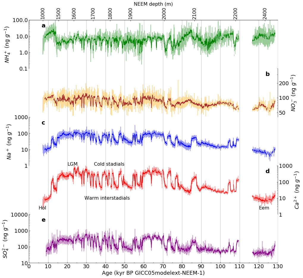
References#
Free Software Foundation. The GNU General Public License v3.0, accessed 4 April 2022. https://www.gnu.org/licenses/gpl-3.0.en.html
2. McKinney, Wes. Python for Data Analysis: Data Wrangling with Pandas, NumPy, and IPython, Second Edition, O’Reilly Media, September 2018. https://wesmckinney.com/pages/book.html (author’s page) and https://github.com/wesm/pydata-book (datasets and Jupyter notebooks)
3. Python Software Foundation. Python 3.10.4 Documentation, 2001-2022. https://docs.python.org/3/
4. Schüpbach, S., et al. “Greenland records of aerosol source and atmospheric lifetime changes from the Eemian to the Holocene,” Nature Communications, volume 9, Article number: 1476 (2018), last accessed 15 April 2022. https://www.nature.com/articles/s41467-018-03924-3
5. VanderPlas, Jake. Python Data Science Handbook: Essential Tools for Working with Data, November 2016. https://jakevdp.github.io/PythonDataScienceHandbook/ (book in html) and https://github.com/jakevdp/PythonDataScienceHandbook (full text in Jupyter notebooks)
6. VanderPlas, Jake. A Whirlwind Tour of Python, August 2016. https://jakevdp.github.io/WhirlwindTourOfPython/ (free Jupyter notebooks and pdf)